


Top 100 - Monochromes
The 100 monochromes that changed art
From Carré noir to Outrenoir, a hundred works where a single color manages to make a lot of noise without raising its voice.
A monochrome is a work constructed with a single color or a very narrow spectrum of tones. A single color, therefore, but a hundred ways not to stay still.
One color, many stories
A hundred monochromes, and not a hundred times the same thing
Monochrome begins before the avant-gardes with salon jokes, but it becomes a historical proposition with Malevich and Rodchenko. The first makes the Black Square an absolute image; the second presents red, yellow and blue as the logical conclusion of the painting. Nothing modest in these small, tidy fields.
Removing figures does not empty the paint. It simply leaves color, material and light without an alibi, which is sometimes more intimidating than an official portrait.Switch to images
Classification in images
From the Black Square to Rodchenko's red-yellow-blue triptych, monochrome becomes a radical proposition about what painting can still do.
#1
Black square
Color occupies the entire field, but it does not remain still there. Malevich treats color as an icon without a figure: the square illustrates nothing, but it changes the position of everything that comes after. Application, edges and density variations give the hue its own structure. Its rank 1 is due to its historical influence and the way in which it expanded the very definition of art.
See the museum notice →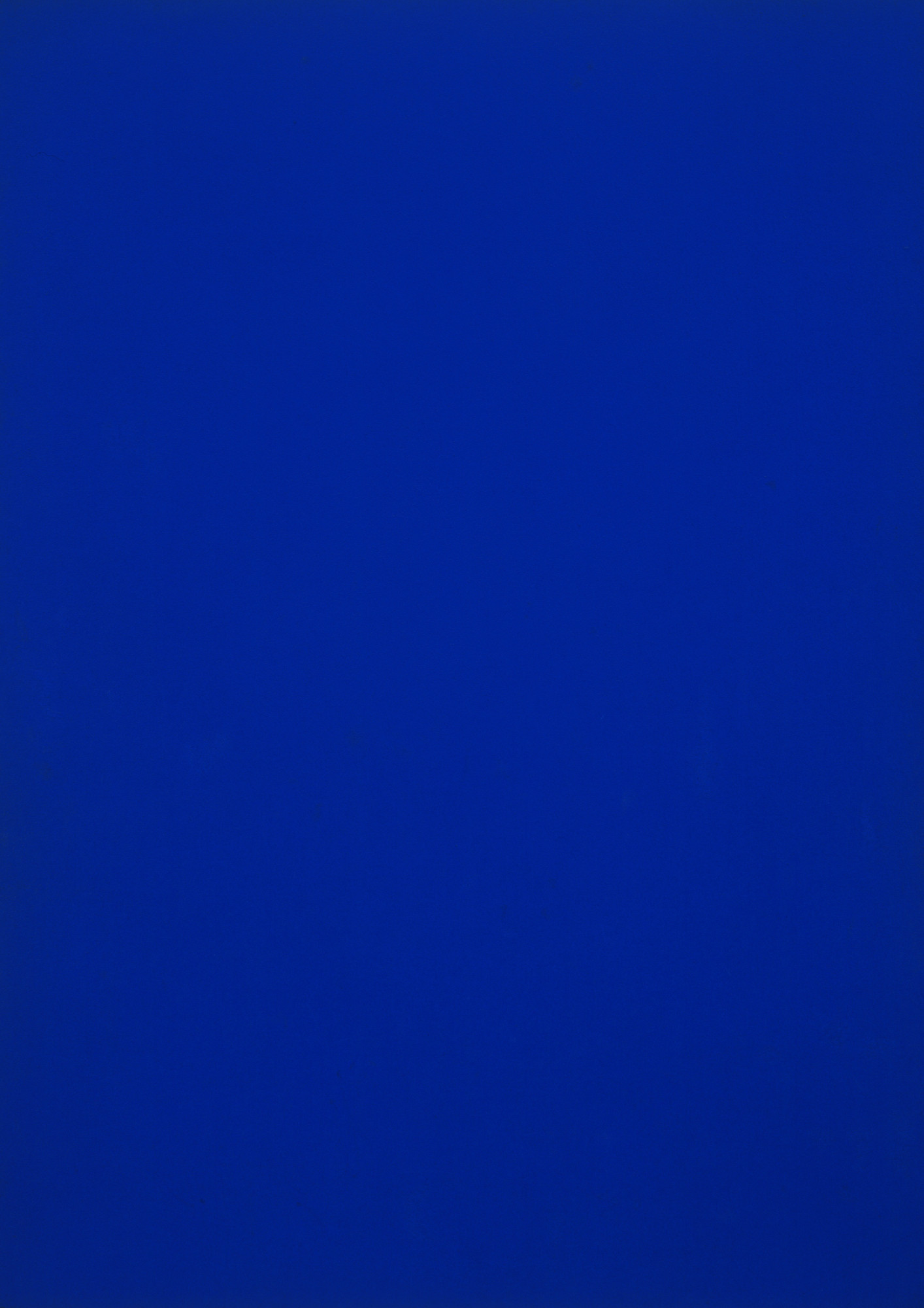 #2
#2
Blue Monochrome
From a distance, the work seems immediate; up close, its surface begins to negotiate. Klein releases the blue of the design and gives it an almost atmospheric depth thanks to a binder which preserves the intensity of the pigment. The application, edges and variations in density give the color its own structure. Its rank 2 is due to its historical influence and the way in which it has broadened the very definition of art.
See the museum notice →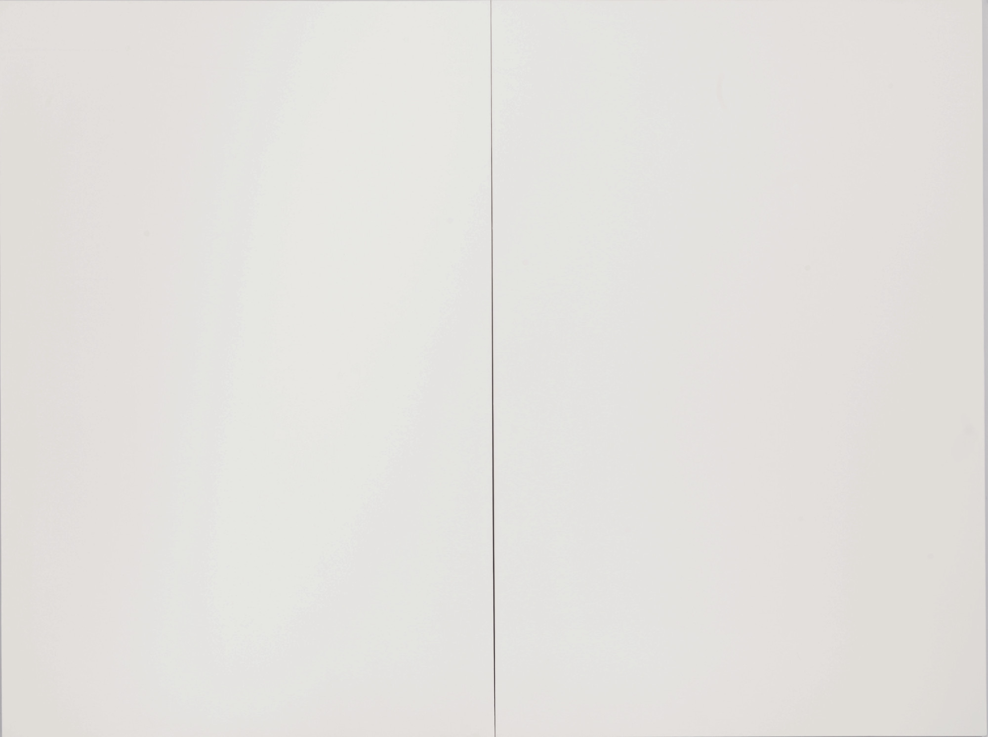 #3
#3
White Painting
The painting removes the subject and lets the production speak. Rauschenberg transforms a seemingly empty surface into a screen sensitive to air, shadows and room movements. The application, edges and variations in density give the shade its own structure. Its rank 3 is due to its historical influence and the way in which it has broadened the very definition of art.
See the museum notice → #4
#4
White square on white background
This surface appears silent, until the light changes place. Malevich treats color like an icon without a figure: the square illustrates nothing, but it changes the position of everything that comes after. The application, edges and variations in density give the shade its own structure. Its rank 4 is due to its historical influence and the way in which it broadened the very definition of art.
See the museum notice → #5
#5
Pure Red Color, Pure Yellow Color, Pure Blue Color
A single shade here is enough to organize depth, rhythm and resistance. Rodchenko pushes the painting towards its material conclusion: a color, a plan and no more narrative pretext to distract the eye. The application, edges and variations in density give the shade its own structure. Its rank 5 is due to its historical influence and the way in which it has broadened the very definition of art.
See the museum notice → #6
#6
Abstract Painting, 1960-65
The eye first looks for an image, then understands that the image is the material itself. Reinhardt hides deviations of black or gray in a structure that only occurs after a few seconds of visual patience. The application, edges and density variations give the shade its own structure. Its rank 6 is due to its historical influence and the way in which it has broadened the very definition of art.
See the museum notice → #7
#7
Achrome (1957-58)
Monochrome does not erase differences: it forces them to work more finely. Manzoni even refuses to choose a color and lets kaolin, folds or objects make a so-called achrome surface. The material catches the light and makes visible differences that reproduction never quite sums up. Its rank 7 is due to its historical influence and the way in which it has broadened the very definition of art.
See the museum notice →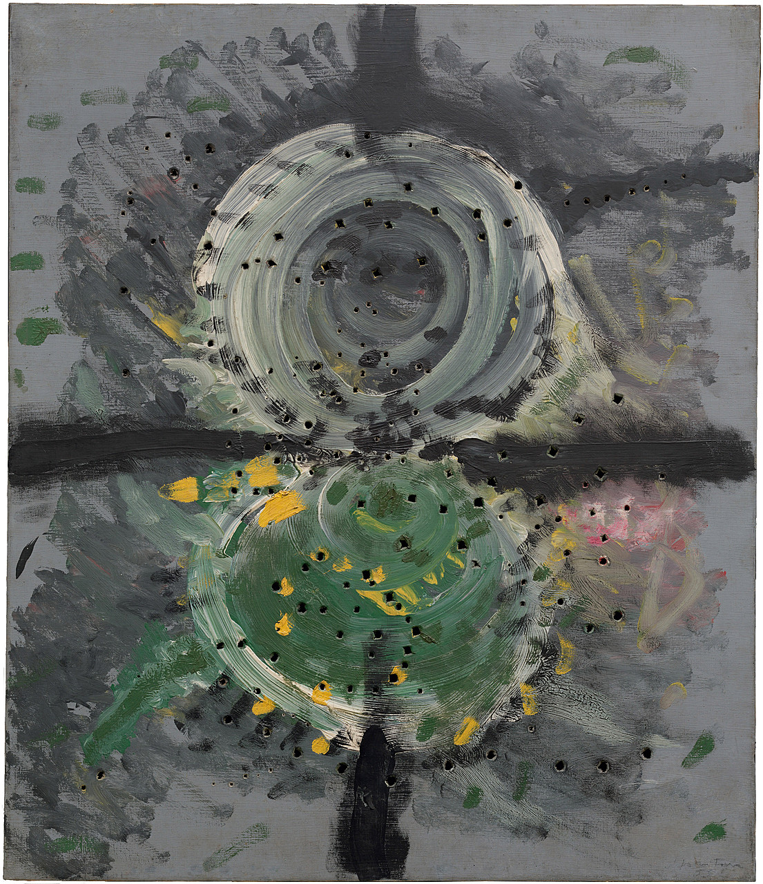 #8
#8
Concetto spaziale
This work reduces the palette without reducing the experience, which is a rather well-managed economy. Fontana literally opens the painted plan: the cut does not damage the image, it introduces the real space behind it. The application, edges and density variations give the color its own structure. Its rank 8 is due to its historical influence and the way in which it broadened the very definition of art.
See the museum notice →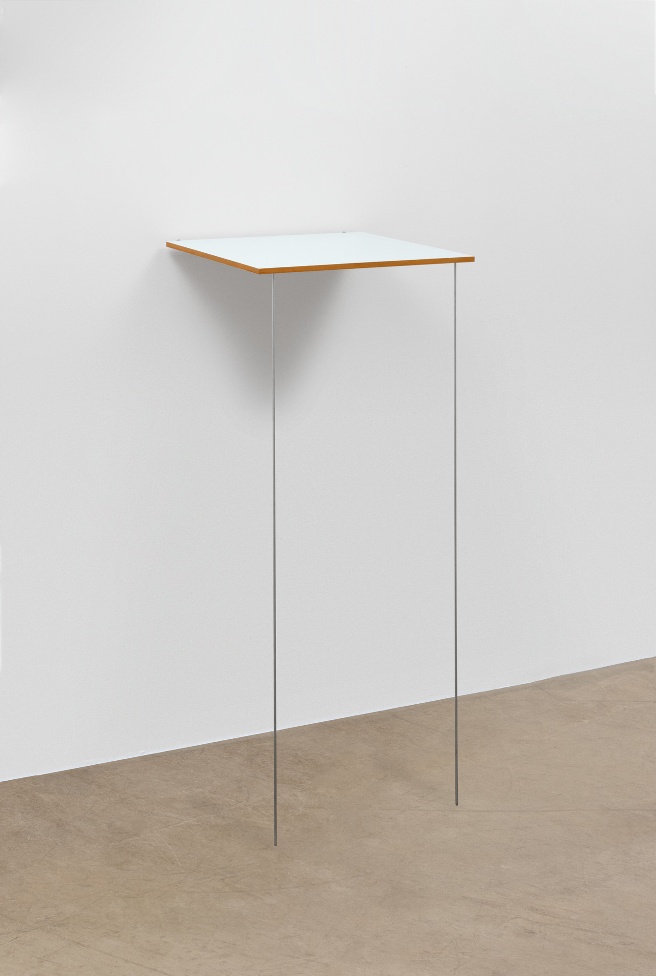 #9
#9
Pace
Color no longer serves as a decor; it becomes structure, weight and duration. Ryman does not paint white as a symbol; he compares paintings, supports, fasteners and edges with the rigor of a very well-lit laboratory. The rigid support gives the color an object presence rather than a simple pictorial depth. Its rank 9 is due to its historical influence and the way in which it broadened the very definition of art.
See the museum notice → #10
#10
Painting 190 x 222 cm, February 5, 2012 (Painting 190 x 222 cm, February 5, 2012)
Nothing is hidden, and yet the gaze takes a moment to understand what is changing. Soulages streaks the black so that it reflects the light; the Outrenoir is therefore not a dark color, but a machine for producing reflections. The application, edges and variations in density give the shade its own structure. Its rank 10 is due to its historical influence and the way in which it has broadened the very definition of art.
See the museum notice →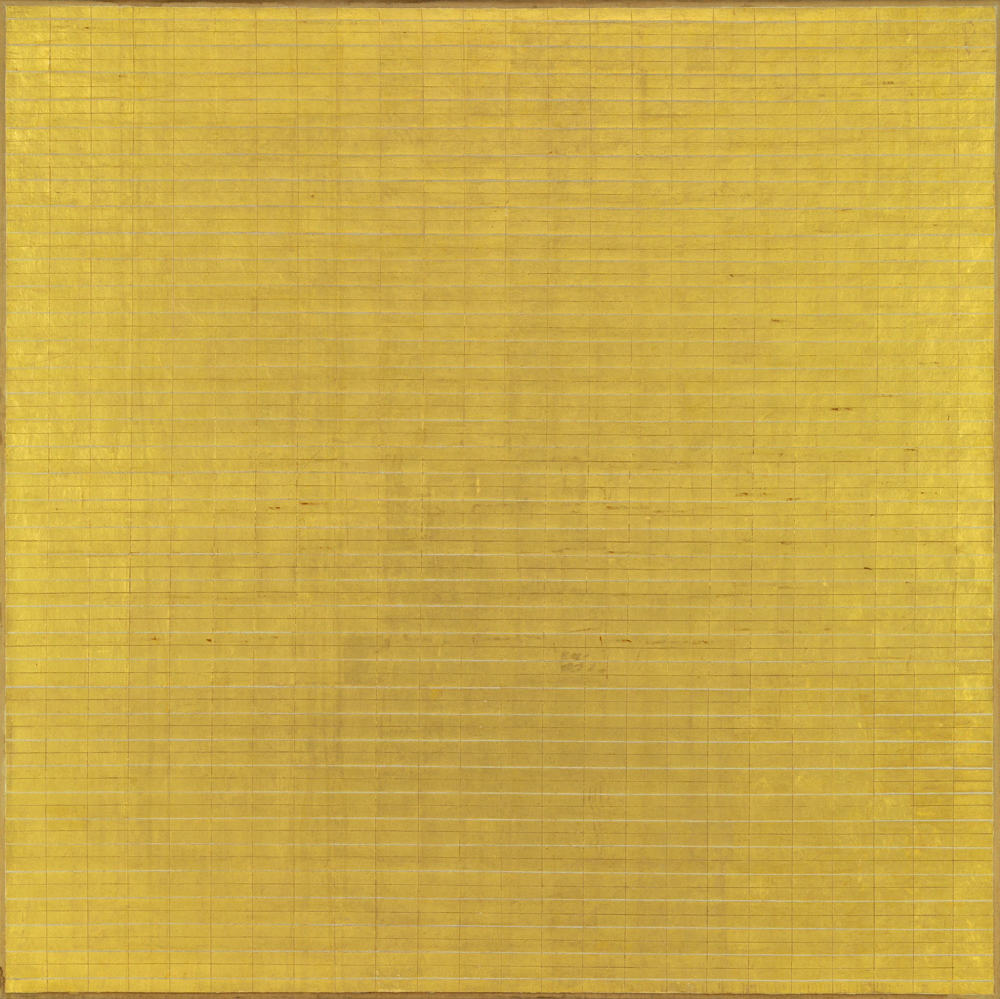 #11
#11
Friendship
The colored field acts as an entire room rather than a background. Martin gives the grid manual breathing: repetition calms the space without making it industrial. The application, edges and variations in density give the shade its own structure. Its rank 11 is due to its historical influence and the way in which it has broadened the very definition of art.
See the museum notice →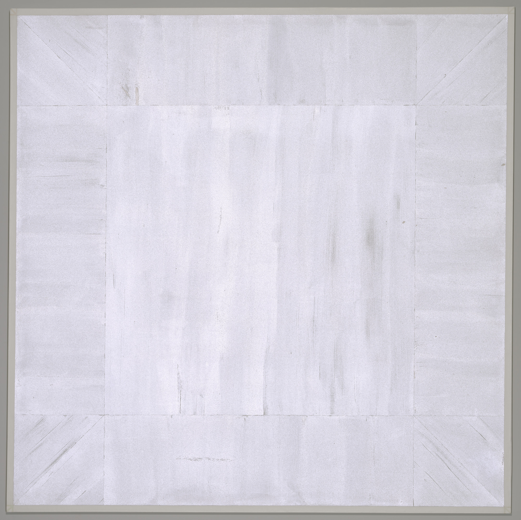 #12
#12
Untitled (First White Light Series)
Here, simplicity is not a shortcut but a pressure exerted on every detail. Corsica incorporates glass microspheres that change with the viewing angle, so that white politely refuses to remain fixed. Transparency and reflection prevent color from remaining locked in the plane. Its rank 12 is due to its historical influence and the way in which it expanded the very definition of art.
See the museum notice → #13
#13
Negro fight, during the night
The dominant hue sets the mood; the edges and texture take care of the rest. Paul Bilhaud uses chromatic restriction to focus attention on the surface, the support and the way the light circulates. The application, edges and variations in density give the shade its own structure. Its rank 13 is due to its historical influence and the way in which it has broadened the very definition of art.
See the museum notice →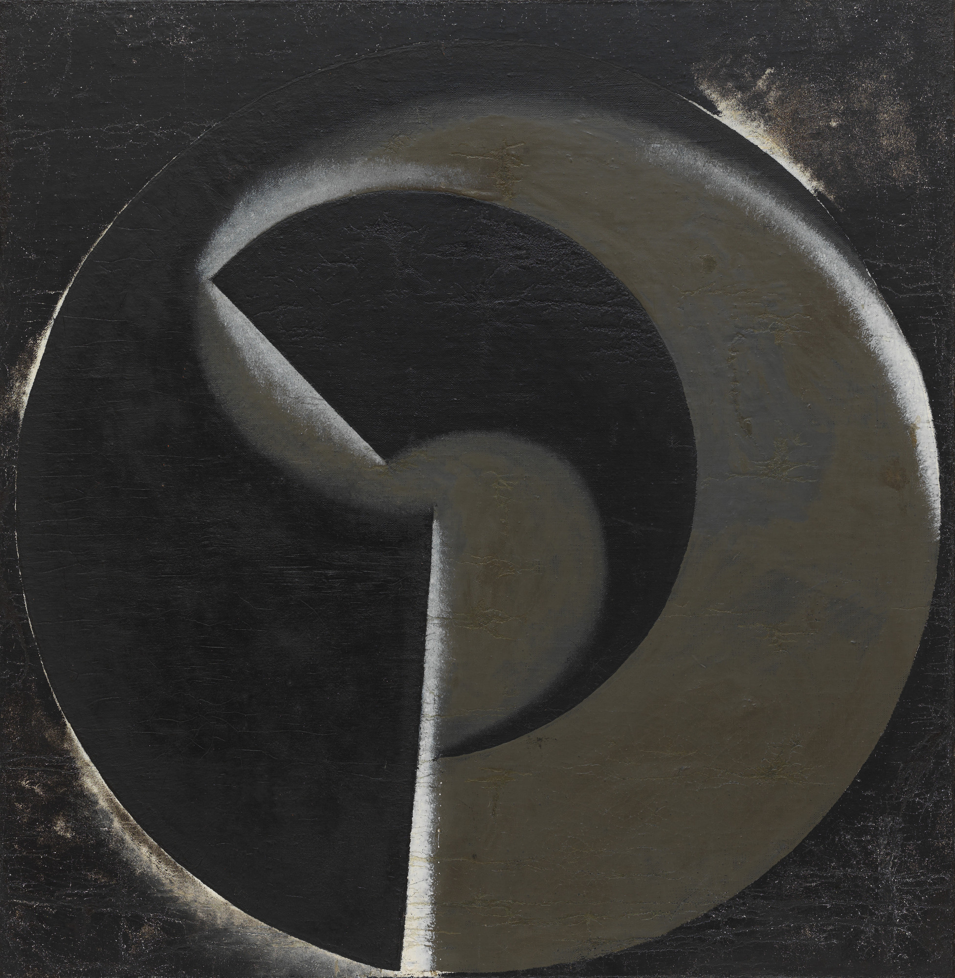 #14
#14
Non-objective painting no. 80 (Black on black)
This monochrome retains enough nuances to make a color chart slightly jealous. Rodchenko pushes the painting towards its material conclusion: a color, a plan and no more narrative pretext to distract the eye. The application, edges and variations in density give the shade its own structure. Its rank 14 is due to its historical influence and the way in which it has broadened the very definition of art.
See the museum notice →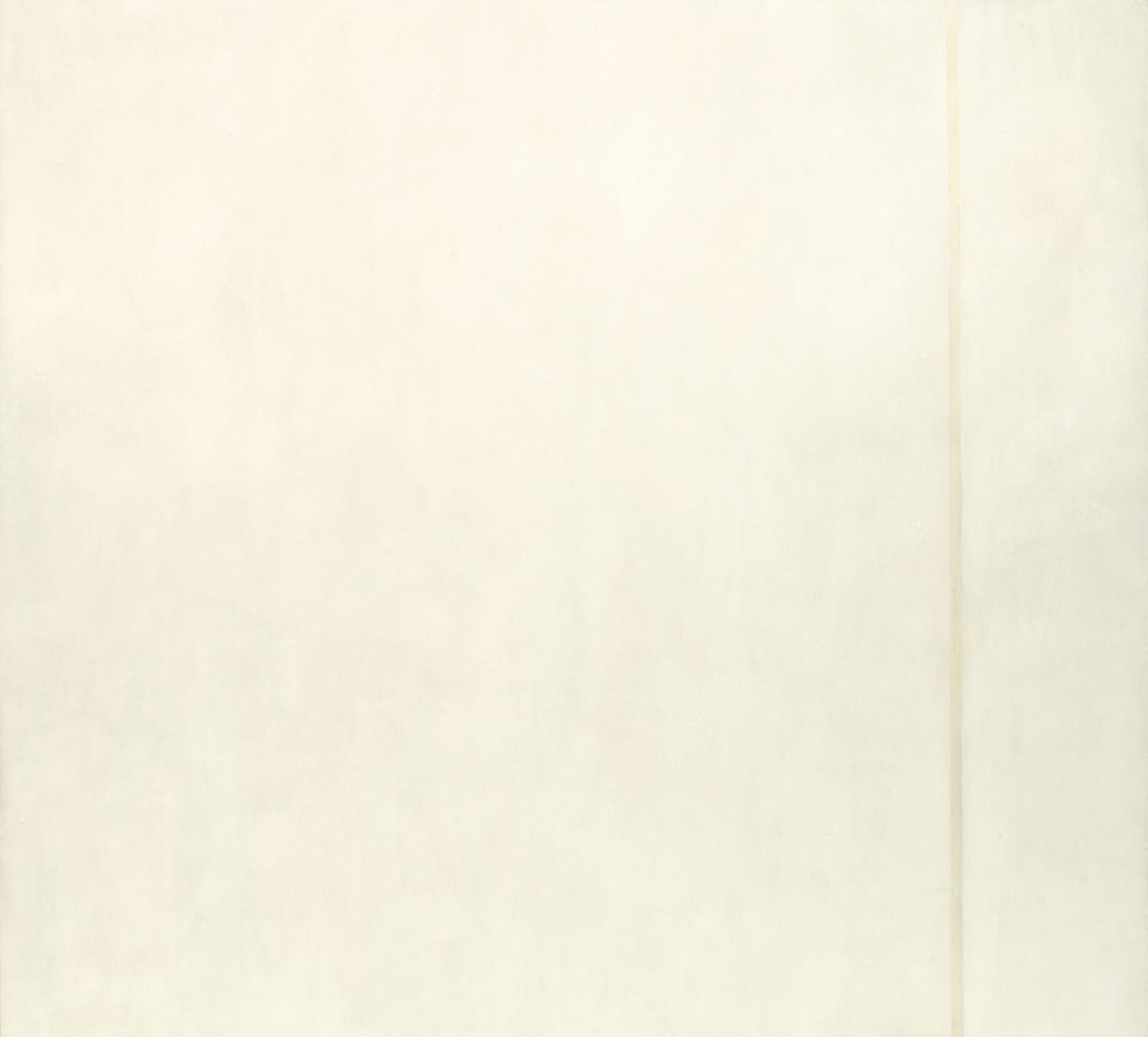 #15
#15
The Voice
The work requires less identification than comparison: matte and shiny, full and hollow, near and far. Barnett Newman uses chromatic restriction to focus attention on the surface, support and way light flows. Application, edges and density variations give the hue its own structure. Its rank 15 is due to its historical influence and the way in which it has broadened the very definition of art.
See the museum notice → #16
#16
Vast Ocean
The gesture is reduced, but its consequence occupies the entire surface. Günther Uecker uses chromatic restriction to focus attention on the surface, the support and the way the light circulates. The reliefs project shadows that renew the surface with lighting. Its rank 16 is due to its historical influence and the way in which it has broadened the very definition of art.
See the museum notice →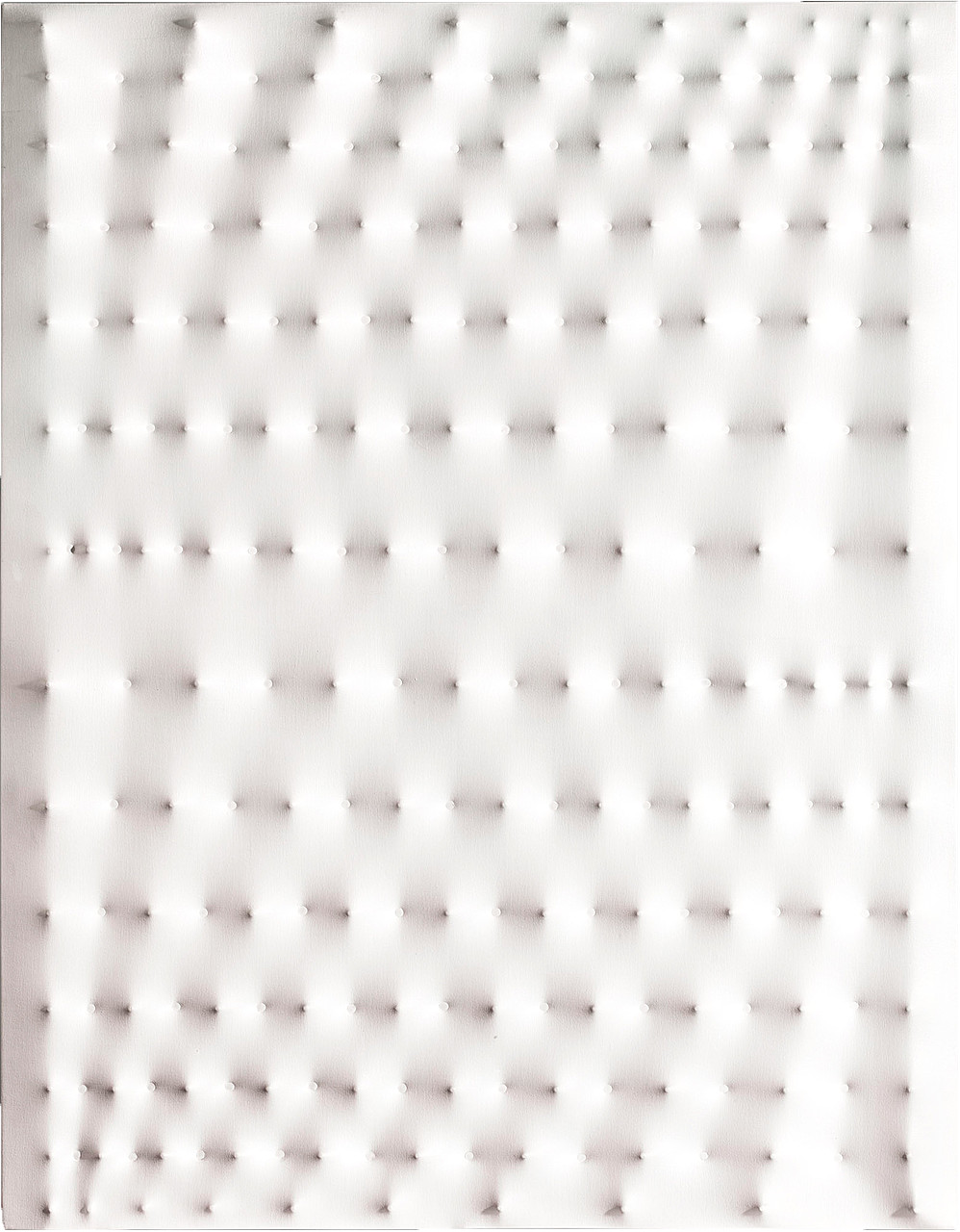 #17
#17
Bianca area
The painting appears without a main character, except perhaps light. Enrico Castellani uses chromatic restriction to focus attention on the surface, support and way the light flows. The application, edges and density variations give the hue its own structure. Its rank 17 is due to its historical influence and the way in which it has broadened the very definition of art.
See the museum notice → #18
#18
No.IZ
This piece shows that a single color can still contain several viewing speeds. Kusama covers the field of an obsessive network whose tiny deviations prevent the surface from becoming a simple wallpaper. The application, edges and variations in density give the shade its own structure. Its rank 18 is due to its historical influence and the way in which it has broadened the very definition of art.
See the museum notice →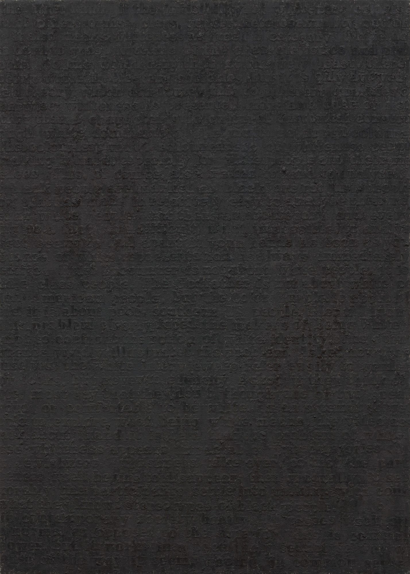 #19
#19
White #19
The medium ceases to be discreet and becomes one of the most active subjects of the work. Glenn Ligon uses chromatic restriction to focus attention on the surface, the medium and the way light flows. The material catches the light and makes visible differences that reproduction never quite sums up. Its rank 19 is due to its historical influence and the way in which it has broadened the very definition of art.
See the museum notice →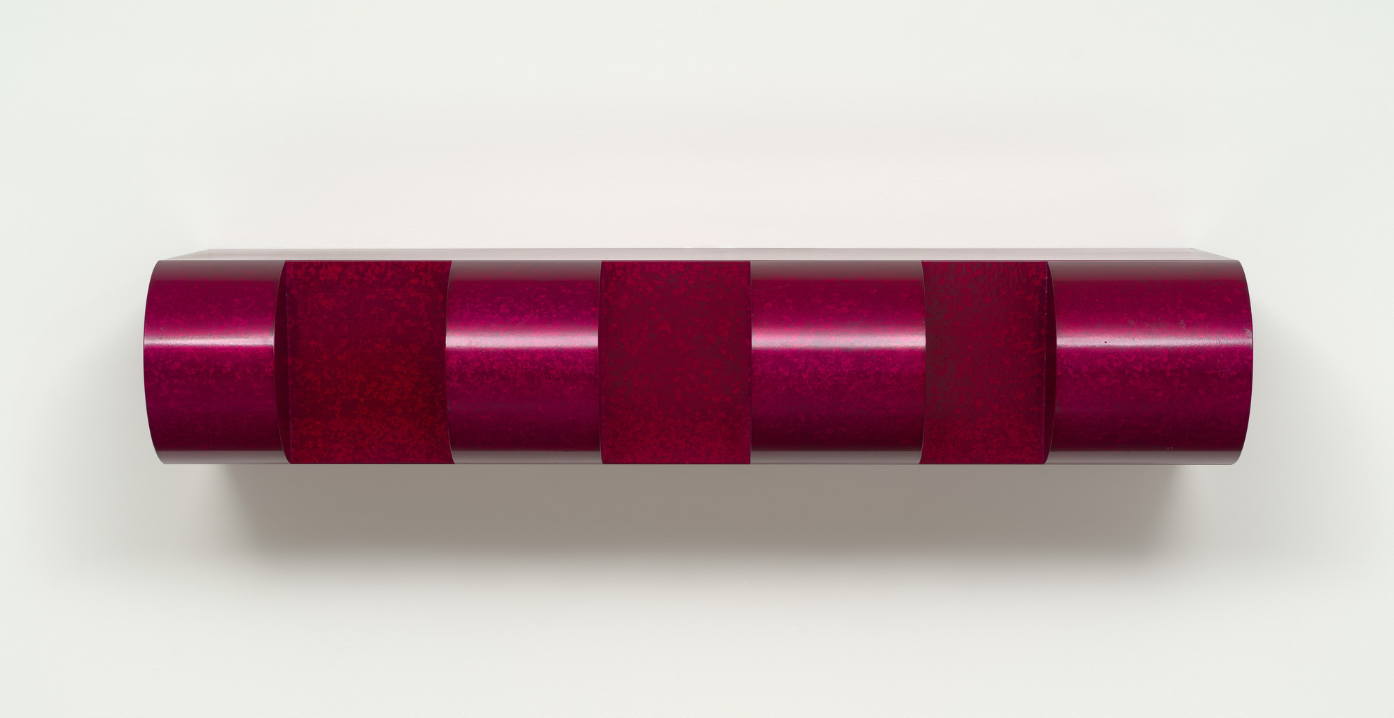 #20
#20
Untitled (1967)
The composition does not tell a scene; she organizes a physical encounter with color. Judd moves the monochrome towards the object: color, transparency, metal and interval finally occupy the same space as the visitor. Transparency and reflection prevent color from remaining locked in the plane. Its rank 20 is due to its historical influence and the way in which it has broadened the very definition of art.
See the museum notice →Reinhardt, Stella, Kelly, Hafif and Manzoni replace the scene with a field, a shape, a pigment or a material that stands alone.
 #21
#21
Gray
Color occupies the entire field, but it does not remain still there. Gerhard Richter uses chromatic restriction to focus attention on the surface, the support and the way the light circulates. The application, edges and density variations give the shade its own structure. The 1972-73 mark; Art Institute of Chicago; 250.2 × 200 cm (98 1/2 × 78 3/4 in.) precisely identifies it and distinguishes it from the artist's other series.
See the museum notice →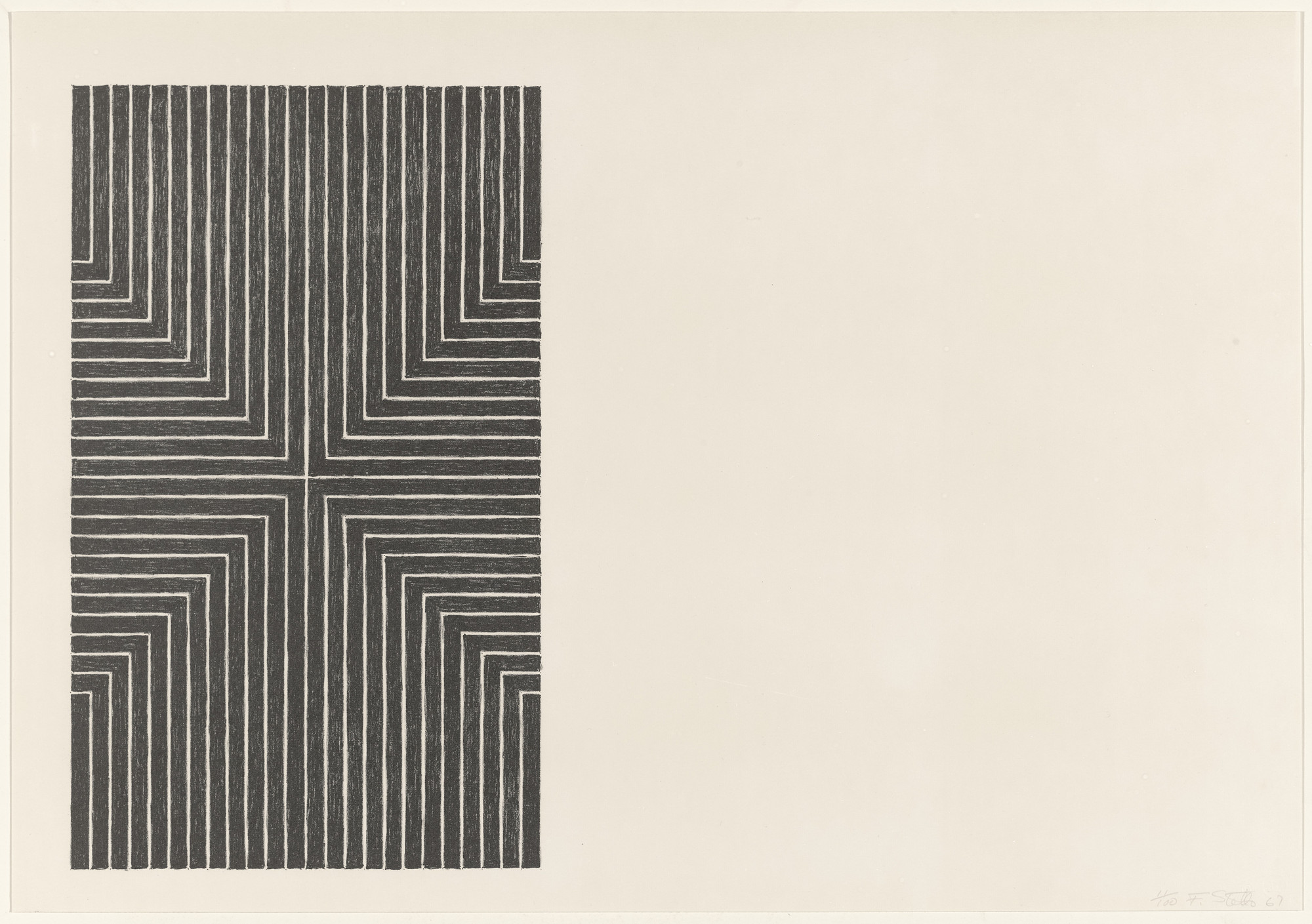 #22
#22
Die Fahne Hoch!
From a distance, the work seems immediate; up close, its surface begins to negotiate. Frank Stella uses chromatic restriction to focus attention on the surface, support and way light flows. The application, edges and density variations give the shade its own structure. The 1959 marker; Whitney Museum of American Art; 308.6 × 185.4 cm precisely identifies it and distinguishes it from the artist's other series.
See the museum notice → #23
#23
Red Plank
The painting removes the subject and lets the production speak. John McCracken uses chromatic restriction to focus attention on the surface, support, and how light flows. Transparency and reflection prevent color from remaining locked in the plane. The 1969 marker; Art Institute of Chicago; 244.1 × 56.6 × 7.9 cm (96 1/8 × 22 1/4 × 3 1/8 in.) precisely identifies it and distinguishes it from the artist's other series.
See the museum notice → #24
#24
Untitled Relief (170 squares)
This surface appears silent, until the light changes place. Jan Schoonhoven uses chromatic restriction to focus attention on the surface, the support and the way the light circulates. The paper absorbs, wrinkles or returns the pigment with a fragility very different from the canvas. The reference c. 1962/63; Art Institute of Chicago; 74 × 47 × 5 cm (29 1/2 × 18 1/2 × 2 in.) precisely identifies it and distinguishes it from the artist's other series.
See the museum notice → #25
#25
Mass Tone: Manganese Blue
A single shade here is enough to organize depth, rhythm and resistance. Hafif examines one pigment at a time and makes visible density, brush direction and paint behavior. Application, edges and density variations give the shade its own structure. The 1974 mark; Art Institute of Chicago; 96.5 × 96.5 cm (38 × 38 in.) precisely identifies it and distinguishes it from the artist's other series.
See the museum notice → #26
#26
Mass Tone Painting: Alizarin Crimson, April 24, 1974
The eye first looks for an image, then understands that the image is the material itself. Hafif examines one pigment at a time and makes visible density, brush direction and paint behavior. Application, edges and density variations give the shade its own structure. The 1974 marker; Art Institute of Chicago; 96.6 × 96.6 cm (38 × 38 in.) precisely identifies it and distinguishes it from the artist's other series.
See the museum notice → #27
#27
Untitled (White Multiple Inner Band, Beveled)
Monochrome does not erase differences: it forces them to work more finely. Corsica incorporates glass microspheres that change with the viewing angle, so that white politely refuses to remain fixed. Transparency and reflection prevent color from remaining locked in the plane. The 2012 marker; Art Institute of Chicago; 245.2 × 396.3 × 12.1 cm (96 1/2 × 156 × 4 3/4 in.) precisely identifies it and distinguishes it from the artist's other series.
See the museum notice → #28
#28
Green painting
This work reduces the palette without reducing the experience, which is a rather well-managed economy. Kelly cuts color into sharp shapes that read as paintings, panels and fragments of architecture. The rigid support gives the color an object presence rather than a simple pictorial depth. The 1952 landmark; Art Institute of Chicago; 74.3 × 99.7 cm rather than a simple pictorial depth. The 1952 landmark; Art Institute of Chicago; 74.3 × 99.7 cm (29 1/4 × 39 1/4 in.) precisely identifies it and distinguishes it from the artist's other series.
See the museum notice → #29
#29
June 29, 1965
Color no longer serves as a decor; it becomes structure, weight and duration. Soulages streaks black so that it reflects light; the Outrenoir is therefore not a dark color, but a machine for producing reflections. The application, edges and variations in density give the color its own structure. The 1965 mark; Art Institute of Chicago; 161.9 × 201.9 cm (62 3/4 × 79 1/2 in.) precisely identifies it and distinguishes it from the artist's other series.
See the museum notice → #30
#30
March 17, 1960
Nothing is hidden, and yet the gaze takes a moment to understand what is changing. Soulages streaks the black so that it reflects the light; the Outrenoir is therefore not a dark color, but a machine for producing reflections. The application, edges and variations in density give the color its own structure. The 1960 mark; Art Institute of Chicago; 130.2 × 162.6 cm (51 1/4 × 64 in.) precisely identifies it and distinguishes it from the artist's other series.
See the museum notice → #31
#31
Presence
The colored field acts as an entire room rather than a background. Shirazeh Houshiary uses color restriction to focus attention on the surface, support and way light flows. Application, edges and density variations give the shade its own structure. The 2000 marker; Museum of Modern Art, New York; Variable precisely identifies it and distinguishes it from the artist's other series.
See the museum notice →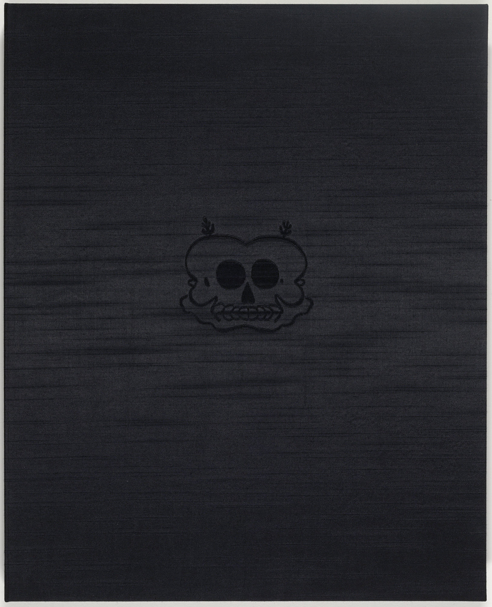 #32
#32
Bye and Bye (Nine Sad Etchings)
Here, simplicity is not a shortcut but a pressure on every detail. Trenton Doyle Hancock uses chromatic restriction to focus attention on the surface, the medium and the way light flows. The paper absorbs, wrinkles or returns the pigment with a fragility very different from the canvas. The 2002 marker; Museum of Modern Art, New York; Nine sheets precisely identify it and distinguish it from the artist's other series.
See the museum notice →![Untitled [black painting on paper], monochrome work by Robert Rauschenberg](https://www.moma.org/media/W1siZiIsIjU2NjU1MSJdLFsicCIsImNvbnZlcnQiLCItcXVhbGl0eSA5MCAtcmVzaXplIDIwMDB4MjAwMFx1MDAzZSJdXQ.jpg?sha=ff84e7dc847c2d4a) #33
#33
Untitled [black painting on paper]
The dominant hue sets the mood; the edges and texture take care of the rest. Rauschenberg transforms a seemingly empty surface into a screen sensitive to air, shadows and room movements. The paper absorbs, wrinkles or reflects pigment with a very different fragility from the canvas. The 1952 marker; Museum of Modern Art, New York; 55.9 × 42.9 cm precisely identifies it and distinguishes it from the artist's other series.
See the museum notice →Grey
This monochrome retains enough nuances to make a color chart slightly jealous. Reinhardt hides deviations of black or gray in a structure that only occurs after a few seconds of visual patience. The application, edges and variations in density give the color its own structure. The 1952 marker; Metropolitan Museum of Art; 152.4 × 127 cm precisely identifies it and distinguishes it from the artist's other series.
See the museum notice → #35
#35
Black and White (1947)
The work requires less identification than comparison: matte and shiny, full and hollow, near and far. Reinhardt hides differences in black or gray in a structure that only occurs after a few seconds of visual patience. The application, edges and variations in density give the color its own structure. The 1947 mark; Art Institute of Chicago; 152.4 × 101.6 cm (60 × 40 in.) precisely identifies it and distinguishes it from the artist's other series.
See the museum notice → #36
#36
Achrome (1962)
The gesture is reduced, but its consequence occupies the entire surface. Manzoni even refuses to choose a color and lets the kaolin, folds or objects make a so-called achrome surface. The material catches the light and makes visible differences that reproduction never quite sums up. The 1962 reference point; Art Institute of Chicago; 80 × 65 cm (30 1/2 × 25 5/8 in.) precisely identifies it and distinguishes it from the artist's other series.
See the museum notice → #37
#37
The Elliott Room: Charter
The painting appears without a main character, except perhaps light. Ryman does not paint white as a symbol; he compares paintings, supports, fasteners and edges with the rigor of a very well-lit laboratory. The rigid support gives the color an object presence rather than a simple pictorial depth. The 1985 mark [series 1985/87]; Art Institute of Chicago; 208.3 × 78.7 × 6.4 cm (82 × 31 × 2 1/2 in.) precisely identifies it and distinguishes it from the artist's other series.
See the museum notice → #38
#38
The Elliott Room: Charter II
This piece shows that a single color can still contain several viewing speeds. Ryman does not paint white as a symbol; he compares paintings, supports, fasteners and edges with the rigor of a very well-lit laboratory. Transparency and reflection prevent color from remaining locked in the plane. The 1987 mark [series 1985-87]; Art Institute of Chicago; 238 × 238 cm (93 3/4 × 93 5/8 in.) precisely identifies it and distinguishes it from the artist's other series.
See the museum notice → #39
#39
The Elliott Room: Charter III
The support ceases to be discreet and becomes one of the most active subjects of the work. Ryman does not paint white as a symbol; he compares paintings, supports, fasteners and edges with the rigor of a very well-lit laboratory. Transparency and reflection prevent color from remaining locked in the shot. The 1987 marker [series 1985/87]; Art Institute of Chicago; 214 × 213 cm (84 1/4 × 84 in.) precisely identifies it and distinguishes it from the artist's other series.
See the museum notice → #40
#40
The Elliott Room: Charter IV
The composition does not tell a scene; she organizes a physical encounter with color. Ryman does not paint white as a symbol; he compares paintings, supports, fasteners and edges with the rigor of a very well-lit laboratory. Transparency and reflection prevent color from remaining locked in the shot. The 1987 marker [series 1985/87]; Art Institute of Chicago; 184 × 183 cm (72 3/8 × 72 in.) precisely identifies it and distinguishes it from the artist's other series.
See the museum notice →Ryman, Corse, Soulages, Martin, Uecker and Schoonhoven construct surfaces where lighting almost becomes a second author.
 #41
#41
The Elliott Room: Charter V
Color occupies the entire field, but it does not remain still there. Ryman does not paint white as a symbol; he compares paintings, supports, fasteners and edges with the rigor of a very well-lit laboratory. Transparency and reflection prevent color from remaining locked in the plan. The 1987 marker [series 1985/87]; Art Institute of Chicago; 243 × 243 cm (95 1/2 × 95 1/2 in.) precisely identifies it and distinguishes it from the artist's other series.
See the museum notice → #42
#42
Distributor
From a distance, the work seems immediate; up close, its surface begins to negotiate. Ryman does not paint white as a symbol; he compares paintings, supports, fasteners and edges with the rigor of a very well-lit laboratory. Transparency and reflection prevent color from remaining locked in the plane. The 1985 marker; Art Institute of Chicago; 122 × 109.3 cm (48 × 43 in.) precisely identifies it and distinguishes it from the artist's other series.
See the museum notice → #43
#43
Untitled #12 (1977)
The painting removes the subject and lets the production speak. Martin gives the grid manual breathing: repetition calms the space without making it industrial. The material catches the light and makes visible differences that reproduction never quite sums up. The 1977 landmark; Art Institute of Chicago; 182.9 × 182.9 cm (72 × 72 in.) precisely identifies it and distinguishes it from the artist's other series.
See the museum notice → #44
#44
Rodeo
This surface appears silent, until the light changes place. Brice Marden uses chromatic restriction to focus attention on the surface, the support and the way the light circulates. The material catches the light and makes visible differences that reproduction never quite sums up. The 1971 landmark; Art Institute of Chicago; 243.8 × 243.8 cm (96 × 96 in.) precisely identifies it and distinguishes it from the artist's other series.
See the museum notice → #45
#45
Black and White
A single shade here is enough to organize depth, rhythm and resistance. Kelly cuts the color into sharp shapes that can be read as paintings, panels and fragments of architecture. The application, edges and variations in density give the color its own structure. The 1960/61 mark; Art Institute of Chicago; 228.6 × 304.8 cm (90 × 120 in.) precisely identifies it and distinguishes it from the artist's other series.
See the museum notice → #46
#46
Black Panel
The eye first searches for an image, then understands that the image is the material itself. Kelly cuts the color into sharp shapes that read as paintings, panels and fragments of architecture. Transparency and reflection prevent color from remaining locked in the plane. The 1989/99 marker; Art Institute of Chicago; 230.6 × 232.6 cm (90 7/8 × 91 9/16 in.) precisely identifies it and distinguishes it from the artist's other series.
See the museum notice → #47
#47
Green Panel
Monochrome does not erase differences: it forces them to work more finely. Kelly cuts the color into sharp shapes that can be read as paintings, panels and fragments of architecture. Transparency and reflection prevent color from remaining locked in the shot. The 1989/99 marker; Art Institute of Chicago; 269.8 × 208 cm (106 1/4 × 81 13/16 in.) precisely identifies it and distinguishes it from the artist's other series.
See the museum notice → #48
#48
Red Panel
This work reduces the palette without reducing the experience, which is a rather well-managed economy. Kelly cuts the color into sharp shapes that read as paintings, panels and fragments of architecture. Transparency and reflection prevent color from remaining locked in the plan. The 1989/99 marker; Art Institute of Chicago; 190 × 200 cm (75 × 78 3/4 in.) precisely identifies it and distinguishes it from the artist's other series.
See the museum notice → #49
#49
Yuri Gagarin
Color no longer serves as a decor; it becomes structure, weight and duration. Kelly cuts the color into sharp shapes that can be read as paintings, panels and fragments of architecture. The application, edges and variations in density give the color its own structure. The 1960 landmark; Art Institute of Chicago; 56 × 50.8 cm (22 × 20 in.) precisely identifies it and distinguishes it from the artist's other series.
See the museum notice → #50
#50
Yellow Panel
Nothing is hidden, and yet it takes a moment for the eye to understand what is changing. Kelly cuts the color into clear shapes that can be read as paintings, panels and fragments of architecture. Transparency and reflection prevent color from remaining locked in the shot. The 1989/99 marker; Art Institute of Chicago; 189.5 × 212.3 cm (74 5/8 × 83 13/16 in.) precisely identifies it and distinguishes it from the artist's other series.
See the museum notice → #51
#51
Blue Panel
The colored field acts as an entire room rather than a background. Kelly cuts the color into sharp shapes that read as paintings, panels and architectural fragments. Transparency and reflection prevent color from remaining locked in the shot. The 1989/99 marker; Art Institute of Chicago; 231.3 × 233 cm (91 × 91 3/4 in.) precisely identifies it and distinguishes it from the artist's other series.
See the museum notice → #52
#52
Orange Panel
Here, simplicity is not a shortcut but a pressure exerted on every detail. Kelly cuts the color into sharp shapes that can be read as paintings, panels and fragments of architecture. Transparency and reflection prevent color from remaining locked in the shot. The 1989/99 marker; Art Institute of Chicago; 237 × 198 cm (93 7/16 × 78 1/4 in.) precisely identifies it and distinguishes it from the artist's other series.
See the museum notice → #53
#53
White/Black Curve
The dominant hue sets the mood; the edges and texture take care of the rest. Kelly cuts the color into sharp shapes that read as paintings, panels and fragments of architecture. The application, edges and variations in density give the color its own structure. The 1973 marker; Art Institute of Chicago; 178.4 × 295 cm (70 1/4 × 118 in.) precisely identifies it and distinguishes it from the artist's other series.
See the museum notice → #54
#54
Red Diagonal
This monochrome retains enough nuances to make a color chart slightly jealous. Kelly cuts the color into sharp shapes that can be read as paintings, panels and fragments of architecture. The application, edges and variations in density give the color its own structure. The 2007 marker; Art Institute of Chicago; 213.4 × 277.9 × 6.7 cm (84 × 109 3/8 × 2 5/8 in.) precisely identifies it and distinguishes it from the artist's other series.
See the museum notice → #55
#55
Stranger in the Village #13
The work requires less identification than comparison: matte and shiny, full and hollow, near and far. Glenn Ligon uses chromatic restriction to focus attention on the surface, the support and the way light circulates. The material catches the light and makes visible differences that reproduction never quite sums up. The 1998 landmark; Art Institute of Chicago; 193.1 × 335.3 cm (76 × 132 in.) precisely identifies it and distinguishes it from the artist's other series.
See the museum notice → #56
#56
Landscaft (Landscape)
The gesture is reduced, but its consequence occupies the entire surface. Blinky Palermo uses chromatic restriction to focus attention on the surface, the support and the way the light circulates. The rigid support gives the color an object presence rather than a simple pictorial depth. The 1966 mark; Art Institute of Chicago; Top: 8.9 × 148.9 × 2.5 cm (3 9/16 × 58 5/8 × 1 in.); Bottom: 10.2 × 200 × 2.5 cm (3 9/16 × 58 5/8 × 1 in.); Bottom: 10.2 × 200 × 2.5 cm (3 9/16 × 58 5/8 × 1 in.); Bottom: 10.2 × 200 × 2.5 cm (4 1/16 × 78 3/4 × 1 in.); Overall: 36.8 × 200 × 2.5 cm (4 1/16 × 78 3/4 × 1 in.); Bottom: 10.2 × 200 × 2.5 cm (3 9/16 × 58 5/8 × 1 in.); Bottom: 10.2 × 200 × 2.5 cm (3 9/
See the museum notice → #57
#57
Untitled (dyed fabric, 1972)
The painting presents itself without a main character, except perhaps light. Blinky Palermo uses chromatic restriction to focus attention on the surface, support and way the light flows. The rigid support gives the color an object presence rather than simple pictorial depth. The 1972 marker; Art Institute of Chicago; 60.3 × 130.2 cm (23 3/4 × 51 1/4 in.) precisely identifies it and distinguishes it from the artist's other series.
See the museum notice → #58
#58
Crazy Otto
This piece shows that a single color can still contain several viewing speeds. Robert Irwin uses chromatic restriction to focus attention on the surface, support and way light flows. Application, edges and density variations give the shade its own structure. The 1962 mark; Art Institute of Chicago; 167.7 × 165.1 cm (66 × 65 in.) precisely identifies it and distinguishes it from the artist's other series.
See the museum notice → #59
#59
Untitled (acrylic disc, 1969)
The medium ceases to be discreet and becomes one of the most active subjects of the work. Robert Irwin uses chromatic restriction to focus attention on the surface, support and how light flows. Transparency and reflection prevent color from remaining locked in the plane. The 1969 marker; Art Institute of Chicago; In: Diam.: 137 cm (53 15/16 in.); H.: 137 cm (137/15/16 in.); H.: 137 cm (53 15/16 in.); H.: 137 cm (53 15/16 in.); H.: 137 cm (53 15/16 in.); H.: 137.2 cm (54 in.) precisely identifies it and distinguishes it from the artist's other series.
See the museum notice → #60
#60
Work (1958)
Composition does not tell a scene; she organizes a physical encounter with color. Saburo Murakami uses chromatic restriction to focus attention on the surface, the support and the way light circulates. The paper absorbs, wrinkles or returns the pigment with a fragility very different from the canvas. The 1958 marker; Art Institute of Chicago; 124.5 × 90.3 × 8 cm (49 × 35 1/2 × 3 in.) precisely identifies it and distinguishes it from the artist's other series.
See the museum notice →Judd, McCracken, Truitt, Irwin, Palermo and Laib change the color of the wall to the object, relief and installation.
 #61
#61
Untitled (1957)
Color occupies the entire field, but it does not remain still there. Shozo Shimamoto uses chromatic restriction to focus attention on the surface, the support and the way light circulates. The paper absorbs, wrinkles or returns the pigment with a fragility very different from the canvas. The 1957 marker; Art Institute of Chicago; 160 × 128.3 cm (63 × 50 1/2 in.) precisely identifies it and distinguishes it from the artist's other series.
See the museum notice → #62
#62
Oct. 31, 1978 (Today Series, "Tuesday")
From a distance, the work seems immediate; up close, its surface begins to negotiate. On Kawara uses chromatic restriction to focus attention on the surface, the support and the way the light circulates. The paper absorbs, wrinkles or returns the pigment with a fragility very different from the canvas. The 1978 marker; Art Institute of Chicago; 155 × 226 cm (61 × 89 in.) precisely identifies it and distinguishes it from the artist's other series.
See the museum notice → #63
#63
Brilliant Yellow #9
The painting removes the subject and lets the production speak. Jo Baer uses chromatic restriction to focus attention on the surface, support and way the light flows. The application, edges and density variations give the shade its own structure. The 1964/65 mark; Art Institute of Chicago; 121.9 × 152.4 cm (48 × 60 in.) precisely identifies it and distinguishes it from the artist's other series.
See the museum notice → #64
#64
Untitled (1972)
This surface appears silent, until the light changes place. Jo Baer uses chromatic restriction to focus attention on the surface, the support and the way the light circulates. The paper absorbs, wrinkles or returns the pigment with a fragility very different from the canvas. The 1972 marker; Art Institute of Chicago; 22.9 × 24.8 cm (9 1/16 × 9 13/16 in.) precisely identifies it and distinguishes it from the artist's other series.
See the museum notice → #65
#65
Blue Replica #4
A single shade here is enough to organize depth, rhythm and resistance. Jo Baer uses chromatic restriction to focus attention on the surface, the support and the way the light circulates. The paper absorbs, wrinkles or returns the pigment with a fragility very different from the canvas. The 1965 marker; Art Institute of Chicago; 25.3 × 20.3 cm (10 × 8 in.) precisely identifies it and distinguishes it from the artist's other series.
See the museum notice → #66
#66
Scratched Drawing White on White
The eye first looks for an image, then understands that the image is the material itself. Fontana literally opens the painted plane: the cut does not damage the image, it introduces the real space behind it. The paper absorbs, wrinkles or reflects the pigment with a fragility very different from the canvas. The 1964 marker; Art Institute of Chicago; 46 × 58.8 cm (18 1/8 × 23 3/16 in.) precisely identifies it and distinguishes it from the artist's other series.
See the museum notice → #67
#67
Sum Confluence
Monochrome does not erase differences: it forces them to work more finely. Richard Tuttle uses chromatic restriction to focus attention on the surface, the support and the way light flows. The rigid support gives the color an object presence rather than a simple pictorial depth. The 1964 marker; Art Institute of Chicago; 52.4 × 92.7 × 7.6 cm (20 5/8 × 36 1/2 × 3 in.) precisely identifies it and distinguishes it from the artist's other series.
See the museum notice → #68
#68
The Possibility of Pointing
This work reduces the palette without reducing the experience, which is a rather well-managed economy. Richard Tuttle uses chromatic restriction to focus attention on the surface, the support and the way the light circulates. The paper absorbs, wrinkles or returns the pigment with a fragility very different from the canvas. The 1973 marker; Art Institute of Chicago; 35.2 × 28 cm (13 7/8 × 11 1/16 in.) precisely identifies it and distinguishes it from the artist's other series.
See the museum notice → #69
#69
Spoon, from Left to Right
Color no longer serves as decor; it becomes structure, weight and duration. Richard Tuttle uses chromatic restriction to focus attention on the surface, the support and the way light circulates. The paper absorbs, wrinkles or returns the pigment with a fragility very different from the canvas. The 1973 marker; Art Institute of Chicago; 35.2 × 28 cm (13 7/8 × 11 1/16 in.) precisely identifies it and distinguishes it from the artist's other series.
See the museum notice → #70
#70
Making Green
Nothing is hidden, and yet it takes a moment for the gaze to understand what is changing. Richard Tuttle uses chromatic restriction to focus attention on the surface, the support and the way light circulates. The paper absorbs, wrinkles or returns the pigment with a fragility very different from the canvas. The 1973 marker; Art Institute of Chicago; 35.2 × 28 cm (13 7/8 × 11 1/16 in.) precisely identifies it and distinguishes it from the artist's other series.
See the museum notice → #71
#71
Untitled (1966)
The colored field acts as an entire piece rather than a background. Robert Mangold uses chromatic restriction to focus attention on the surface, support and way light flows. Application, edges and density variations give the shade its own structure. The 1966 marker; Art Institute of Chicago; 35.5 × 35.5 cm (14 × 14 in.) precisely identifies it and distinguishes it from the artist's other series.
See the museum notice → #72
#72
Green/2 Orange X Painting
Here, simplicity is not a shortcut but a pressure on every detail. Robert Mangold uses chromatic restriction to focus attention on the surface, support and way the light flows. Application, edges and density variations give the shade its own structure. The 1983 marker; Art Institute of Chicago; 243.8 × 254.6 cm (96 × 100 1/4 in.) precisely identifies it and distinguishes it from the artist's other series.
See the museum notice → #73
#73
From the nada vida to the nada muerte
The dominant hue sets the mood; the edges and texture take care of the rest. Frank Stella uses chromatic restriction to focus attention on the surface, the support and the way the light flows. The rigid support gives the color an object presence rather than a simple pictorial depth. The 1965 marker; Art Institute of Chicago; 205.7 × 744.2 cm (81 × 293 in.) precisely identifies it and distinguishes it from the artist's other series.
See the museum notice → #74
#74
Hatra I
This monochrome retains enough nuances to make a color chart slightly jealous. Frank Stella uses chromatic restriction to focus attention on the surface, support and way the light flows. The application, edges and density variations give the shade its own structure. The 1967 marker; Art Institute of Chicago; 304.8 × 609.6 cm (120 × 240 in.) precisely identifies it and distinguishes it from the artist's other series.
See the museum notice → #75
#75
Untitled 3 (1950)
The work requires less identification than comparison: matte and shiny, solid and hollow, near and far. Barnett Newman uses chromatic restriction to focus attention on the surface, support and way light flows. Application, edges and density variations give the shade its own structure. The 1950 landmark; Art Institute of Chicago; 142.2 × 7.6 cm (56 × 3 in.) precisely identifies it and distinguishes it from the artist's other series.
See the museum notice → #76
#76
April 20, 74
The gesture is reduced, but its consequence occupies the entire surface. Anne Truitt uses chromatic restriction to focus attention on the surface, the support and the way the light circulates. The paper absorbs, wrinkles or returns the pigment with a fragility very different from the canvas. The 1974 marker; Art Institute of Chicago; 58.4 × 73.7 cm (23 × 29 1/16 in.) precisely identifies it and distinguishes it from the artist's other series.
See the museum notice → #77
#77
Seven
The painting presents itself without a main character, except perhaps light. Anne Truitt uses chromatic restriction to focus attention on the surface, the support and the way the light circulates. The rigid support gives the color an object presence rather than a simple pictorial depth. The 1962 marker; Art Institute of Chicago; 137 × 81 × 20 cm (53 3/4 × 32 × 7 7/8 in.) precisely identifies it and distinguishes it from the artist's other series.
See the museum notice → #78
#78
Untitled (Plank Study)
This piece shows that a single color can still contain multiple viewing speeds. John McCracken uses chromatic restriction to focus attention on the surface, support and way light flows. The paper absorbs, wrinkles or returns the pigment with a fragility very different from the canvas. The 1972 marker; Art Institute of Chicago; 21.6 × 27.9 cm (8 9/16 × 11 in.) precisely identifies it and distinguishes it from the artist's other series.
See the museum notice → #79
#79
Untitled (amber stack, 1968)
The support ceases to be discreet and becomes one of the most active subjects of the work. Judd moves the monochrome towards the object: color, transparency, metal and interval finally occupy the same space as the visitor. Transparency and reflection prevent color from remaining locked in the plane. The 1968 marker; Art Institute of Chicago; Each unit: 15.2 × 68.6 × 61 cm (6 × 27 1/16 × 24 1/16 in.); 15.3 × 68.6 × 61 cm (6 × 27 1/16 × 24 1/16 in.); 15.3 × 68.6 × 61 cm (6 × 27 1/16 × 24 1/16 in.); 15.3 × 68.6 × 61 cm (6 × 27 1/16 × 24 1/16 in.); 15.3 × 68.6 × 61 cm (6 × 27 1/16 × 24
See the museum notice → #80
#80
Untitled (steel and acrylic, 1968)
The composition does not tell a scene; it organizes a physical encounter with color. Judd moves the monochrome towards the object: color, transparency, metal and interval finally occupy the same space as the visitor. The rigid support gives the color an object presence rather than a simple pictorial depth. The 1968 marker; Art Institute of Chicago; 83.2 × 171.5 × 121.9 cm (32 3/4 × 67 1/2 × 48 in.) precisely identifies it and distinguishes it from the artist's other series.
See the museum notice →Gutai, Korean practices, writing, textiles and contemporary pigments show that monochrome never signed its obituary.
 #81
#81
Orange Grid Design Series
Color occupies the entire field, but it does not remain still there. Judd moves the monochrome towards the object: color, transparency, metal and interval finally occupy the same space as the visitor. The paper absorbs, wrinkles or returns the pigment with a fragility very different from the canvas. The 1961/69 mark; Art Institute of Chicago; Image: 66.5 × 40.5 cm (26 3/16 × 16 in.); Sheet: 77.9 × 56 cm (26 3/16 × 16 in.); Sheet: 77.9 × 56 cm (26 3/16 × 16 in.); Sheet: 77.9 × 56 cm (26 3/16 × 16 in.); Sheet: 77.9 × 56 cm (26 3/16 × 16 in.); Sheet: 77.9 × 56 cm (26 3/16 × 16 in.); Sheet: 77.9 × 56 cm (26 3
See the museum notice → #82
#82
Untitled (plywood, 1976)
From a distance, the work seems immediate; up close, its surface begins to negotiate. Judd moves the monochrome towards the object: color, transparency, metal and interval finally occupy the same space as the visitor. The rigid support gives the color an object presence rather than a simple pictorial depth. The 1976 marker; Art Institute of Chicago; 91.5 × 233 × 214.6 cm (36 × 91 3/4 × 84 1/2 in.) precisely identifies it and distinguishes it from the artist's other series.
See the museum notice → #83
#83
Untitled (galvanized iron, 1972-73)
The painting removes the subject and lets the production speak. Judd moves the monochrome towards the object: color, transparency, metal and interval finally occupy the same space as the visitor. The rigid support gives the color an object presence rather than a simple pictorial depth. The c mark. 1972/73; Art Institute of Chicago; 57.2 × 67.4 × 10.2 cm (22 1/2 × 26 1/2 × 4 in.) precisely identifies it and distinguishes it from the artist's other series.
See the museum notice → #84
#84
White Cross, from Russian Room
This surface appears silent, until the light changes place. Imi Knoebel uses chromatic restriction to focus attention on the surface, the support and the way the light circulates. The paper absorbs, wrinkles or returns the pigment with a fragility very different from the canvas. The nd marker; Art Institute of Chicago; 73 × 102 cm (28 3/4 × 40 3/16 in.) precisely identifies it and distinguishes it from the artist's other series.
See the museum notice → #85
#85
Black Cross, from Russian Room
A single shade here is enough to organize depth, rhythm and resistance. Imi Knoebel uses chromatic restriction to focus attention on the surface, the support and the way the light circulates. The paper absorbs, wrinkles or returns the pigment with a fragility very different from the canvas. The reference nd; Art Institute of Chicago; 73 × 102 cm (28 3/4 × 40 3/16 in.) precisely identifies it and distinguishes it from the artist's other series.
See the museum notice → #86
#86
Black Square, from Russian Room
The eye first looks for an image, then understands that the image is the material itself. Imi Knoebel uses chromatic restriction to focus attention on the surface, the support and the way light circulates. The paper absorbs, wrinkles or reflects the pigment with a fragility very different from the canvas. The reference nd; Art Institute of Chicago; 73 × 102 cm (28 3/4 × 40 3/16 in.) precisely identifies it and distinguishes it from the artist's other series.
See the museum notice → #87
#87
White Square, from Russian Room
Monochrome does not erase differences: it forces them to work more finely. Imi Knoebel uses chromatic restriction to focus attention on the surface, the support and the way light circulates. The paper absorbs, wrinkles or returns the pigment with a fragility very different from the canvas. The 1988 marker; Art Institute of Chicago; 73 × 102 cm (28 3/4 × 40 3/16 in.) precisely identifies it and distinguishes it from the artist's other series.
See the museum notice → #88
#88
Big Russian Wall, from Russian Room
This work reduces the palette without reducing the experience, which is a rather well-managed economy. Imi Knoebel uses chromatic restriction to focus attention on the surface, the support and the way the light circulates. The paper absorbs, wrinkles or returns the pigment with a fragility very different from the canvas. The reference nd; Art Institute of Chicago; 73 × 102 cm (28 3/4 × 40 3/16 in.) precisely identifies it and distinguishes it from the artist's other series.
See the museum notice → #89
#89
Rice House
Color no longer serves as decor; it becomes structure, weight and duration. Wolfgang Laib uses chromatic restriction to focus attention on the surface, support and way light flows. Application, edges and density variations give the shade its own structure. The 2001 mark; Art Institute of Chicago; 36 × 35 × 130 cm (14 3/16 × 13 3/4 × 51 3/16 in.) precisely identifies it and distinguishes it from the artist's other series.
See the museum notice → #90
#90
Gold Mats, Paired -for Ross and Felix
Nothing is hidden, and yet the gaze takes a moment to understand what is changing. Roni Horn uses chromatic restriction to focus attention on the surface, the support and the way the light circulates. The application, edges and density variations give the shade its own structure. The 1994/95 mark; Art Institute of Chicago; 124.5 × 152.4 × 0.1 cm (49 × 60 × 1/16 in.) precisely identifies it and distinguishes it from the artist's other series.
See the museum notice → #91
#91
Deeps and Skies
The colored field acts as an entire room rather than a background. Roni Horn uses color restriction to focus attention on the surface, support and how light flows. Transparency and reflection prevent color from remaining locked in the plane. The 1995-96 mark; Art Institute of Chicago; 21.3 × 103.2 × 76.8 cm (8 3/8 × 40 5/8 × 30 1/4 in.) precisely identifies it and distinguishes it from the artist's other series.
See the museum notice → #92
#92
Propagation-15 (Black and White)
Here, simplicity is not a shortcut but a pressure exerted on every detail. Matsutani causes the surface to swell, flow or stretch; the unique color serves as the ground for an almost corporeal material. The paper absorbs, wrinkles or returns the pigment with a fragility very different from the canvas. The 1967 marker; Art Institute of Chicago; Plate: 29.5 × 39 cm (11 5/8 × 15 3/8 in.); Sheet: 50.2 × 64.8 cm (11 5/8 × 15 3/8 in.); Sheet: 50.2 × 64.8 cm (11 5/8 × 15 3/8 in.); Sheet: 50.2 × 64.8 cm (11 5/8 × 15 3/8 in.); Sheet: 29.5 × 39 cm (11 5/8 × 15 3/8 in.); Sheet: 50.2 × 64.8 cm (11 5/8 × 15
See the museum notice → #93
#93
Green Spreading
The dominant hue sets the mood; the edges and texture take care of the rest. Matsutani makes the surface swell, flow or stretch; the unique color serves as the ground for an almost corporeal material. The paper absorbs, wrinkles or reflects the pigment with a fragility very different from the canvas. The 1968 mark; Art Institute of Chicago; Plate: 43.5 × 44.3 cm (17 3/16 × 17 1/2 in.); Sheet: 65 × 50 cm (43.5 × 44.3 cm (17 3/16 × 17 1/2 in.); Sheet: 65 × 50 cm (43.5 × 44.3 cm (17 3/16 × 17 1/2 in.); Sheet: 65 × 50 cm (43.5 × 44.3 cm (17 3/16 × 17 1/2 in.); Sheet: 65 × 50 cm (25 5/
See the museum notice → #94
#94
Propagation-15 (Green)
This monochrome retains enough nuances to make a color chart slightly jealous. Matsutani makes the surface swell, flow or stretch; the unique color serves as the ground for an almost corporeal material. The paper absorbs, wrinkles or reflects the pigment with a fragility very different from the canvas. The 1967 marker; Art Institute of Chicago; Plate: 29.7 × 39 cm (11 3/4 × 15 3/8 in.); Sheet: 50 × 65.1 cm (11 3/4 × 15 3/8 in.); Sheet: 50 × 65.1 cm (11 3/4 × 15 3/8 in.); Sheet: 50 × 65.1 cm (11 3/4 × 15 3/8 in.); Sheet: 50 × 65.1 cm (11 3/4 × 15 3/8 in.); Sheet: 50 × 65.1 cm (11 3/4 × 15 3
See the museum notice → #95
#95
Yellow Y-Propagation
The work requires less identification than comparison: matte and shiny, full and hollow, near and far. Matsutani makes the surface swell, flow or stretch; the unique color serves as the ground for an almost corporeal material. The paper absorbs, wrinkles or reflects the pigment with a fragility very different from the canvas. The 1967 mark; Art Institute of Chicago; Plate: 38.5 × 29.5 cm (15 3/16 × 11 5/8 in.); Sheet: 64.5 × 29.5 cm (15 3/16 × 11 5/8 in.); Sheet: 64.5 × 29.5 cm (15 3/16 × 11 5/8 in.); Sheet: 64.5 × 29.5 cm (15 3/16 × 11 5/8 in.); Sheet: 64.5 × 29.5 cm (15 3/16 × 11 5/8 in.); Sheet: 64.5
See the museum notice → #96
#96
Yellow Propagation
The gesture is reduced, but its consequence occupies the entire surface. Matsutani makes the surface swell, flow or stretch; the unique color serves as the ground for an almost corporeal material. The paper absorbs, wrinkles or returns the pigment with a fragility very different from the canvas. The 1970 marker; Art Institute of Chicago; Sheet: 78 × 57 cm (30 3/4 × 22 1/2 in.) precisely identifies it and distinguishes it from the artist's other series.
See the museum notice → #97
#97
White Sake
The painting appears without a main character, except perhaps light. Matsutani makes the surface swell, flow or tense; the unique color serves as the ground for an almost corporeal material. The paper absorbs, wrinkles or reflects the pigment with a fragility very different from the canvas. The 1970 marker; Art Institute of Chicago; Sheet: 57.2 × 63.2 cm (22 9/16 × 24 15/16 in.) precisely identifies it and distinguishes it from the artist's other series.
See the museum notice → #98
#98
Passing
This piece shows that a single color can still contain multiple viewing speeds. Frank Bowling uses chromatic restriction to focus attention on the surface, support and way light flows. The paper absorbs, wrinkles or returns the pigment with a fragility very different from the canvas. The 2011 marker; Art Institute of Chicago; 56.2 × 75.9 cm (22 1/8 × 29 7/8 in.) precisely identifies it and distinguishes it from the artist's other series.
See the museum notice → #99
#99
Heart of Darkness
The medium ceases to be discreet and becomes one of the most active subjects of the work. Sean Scully uses chromatic restriction to focus attention on the surface, support and how light flows. Application, edges and density variations give the shade its own structure. The 1982 marker; Art Institute of Chicago; 243.9 × 365.8 cm (96 × 144 in.) precisely identifies it and distinguishes it from the artist's other series.
See the museum notice → #100
#100
T 70-27
Composition does not tell a scene; it organizes a physical encounter with color. Jan Schoonhoven uses chromatic restriction to focus attention on the surface, the support and the way light circulates. The paper absorbs, wrinkles or returns the pigment with a fragility very different from the canvas. The 1970 marker; Art Institute of Chicago; 44.8 × 29.3 cm (17 11/16 × 11 9/16 in.) precisely identifies it and distinguishes it from the artist's other series.
See the museum notice →What the ranking reveals
A color is never a single answer
Monochrome can announce the end of painting, celebrate pigment, record light, shift the gaze to the support or transform a panel into an object.
Color becomes subject
For Klein, Hafif or Kelly, color no longer adorns a form: it constitutes the main event.
Matter refuses emptiness
Kaolin, nails, folds, wax, charcoal, glass and textile give the monochrome a skin that changes depending on the distance.
Time enters the image
Ambient light, traces of use, aging and the visitor's position modify works which nevertheless seemed perfectly stable.
A story in five points of reference
Five moments when just one color complicated everything
Paul Bilhaud exhibits a black rectangle with an endless title and installs humor in the prehistory of monochrome.
Malevich makes the square a modern icon and moves the painting out of the representation.
Rodchenko presents three red, yellow and blue panels as the logical conclusion of the painting.
Rauschenberg, Klein, Reinhardt, Fontana and Manzoni work with air, pigment, cut, kaolin and perception.
Minimalism, ZERO, Gutai, Dansaekhwa and contemporary practices transform monochrome into a global laboratory.
Monochrome in depth
How could a single color change so much?
Monochrome begins before the avant-gardes with salon jokes, but it becomes a historical proposition with Malevich and Rodchenko. The first makes the Black Square an absolute image; the second presents red, yellow and blue as the logical conclusion of the painting. Nothing modest in these small, tidy fields.
After 1945, color alone was used to start all over again. Rauschenberg lets the shadows of the world rest on his White Paintings. Klein releases the blue pigment, Reinhardt hides structures in the dark, Manzoni works the achrome and Fontana brings real space in through a cut.
In the 1960s and 1970s, the surface became a laboratory. Ryman compares supports and fasteners, Corsica uses glass microspheres, Uecker plants nails, Castellani stretches the canvas in relief and Hafif studies the behavior of a pigment without asking him to play a character.
Monochrome also comes out of the painting. Kelly, Judd, McCracken, Truitt, Palermo and Irwin give the color thickness, edge, transparency or a place in the room. The visitor must move; the work has already worked enough.
This story is not just European and American. Gutai in Japan, Dansaekhwa in Korea and many contemporary practices use repetition, gesture, paper, textile and material to make the unique field a physical experience.
Notices from MoMA, the Guggenheim, the Art Institute of Chicago, the Metropolitan Museum and the Center Pompidou serve as the basis. Each card corresponds to a distinct identity and image; a black and white photo is not promoted to monochrome simply because it has forgotten its colors.
Four reading keys
How to look without looking for the little hidden figure
Observing the color, surface, support and light allows us to distinguish a hundred works which, on a bad vignette, could seem to have forgotten to present themselves.
Compare the nuances
A monochrome accepts variations in value, density and texture; it does not require a color taken out of a military color chart.
Read the gestures
Roll, fold, nail, notch, grid and wax layer reveal how the work was constructed.
Look at the edges
Canvas, paper, wood, metal, fiberglass and fabric change the presence of color as much as the pigment itself.
Move in front of the work
The microspheres of Corsica, the streaks of Soulages or the reliefs of Castellani are not revealed from a single angle.
Museums, collections and references
Continue after the hundredth color alone
MoMA, the Guggenheim, the Art Institute of Chicago, the Metropolitan Museum and the Center Pompidou document the dates, techniques, dimensions and contexts of these works.
In Alpha Reproduction
01All Top Famous PaintingsAlpha Reproduction Guides02The 100 essential abstract paintingsAlpha Reproduction Guides03The 100 essential paintings of the 20th centuryAlpha Reproduction Guides04Piet Mondrian's 100 essential paintingsAlpha Reproduction GuidesMuseums and references
01Monochrome in the MoMA collectionMuseum & reference02Blue Monochrome by Yves Klein at MoMAMuseum & reference03The Voice by Barnett Newman at MoMAMuseum & reference04Surface, Support, Process at the GuggenheimMuseum & reference05Lucio Fontana at the GuggenheimMuseum & reference06Soulages, the black work at the Center PompidouMuseum & referenceFrequently asked questions
Monochrome without brooding
Some markers to distinguish monochrome, monochrome, grayness, black paint, colored field and simple desaturated image.
What is a monochrome work?
A monochrome work uses a single color or a very tight set of values of the same shade. Texture, relief, transparency and light can produce many variations without making the work polychrome.
What is the most famous monochrome?
Malevich's Black Square is often considered the founding icon of modern monochrome. Blue Monochrome by Yves Klein and the White Paintings by Rauschenberg are also among the best-known landmarks.
Is monochrome always abstract?
Modern monochrome is generally abstract, but it can retain text, a grid, relief or shape. The important thing is that the chromatic restriction structures the experience of the work.
What is the difference between monochrome and gray?
Grisaille mainly uses gray values to represent figures, volumes or architecture. Modern monochrome more often makes color and surface the very subject of the work.
Why are Rauschenberg White Paintings important?
Because their white surfaces record shadows, light and changes in the room. They transform a seemingly empty painting into an active screen for the present time.
Why is Yves Klein's blue special?
Klein worked with a binder that retains the intensity and powdery appearance of overseas. Its International Klein Blue gives the pigment a depth that seems to extend beyond the frame.
Is Soulages a monochrome painter?
Soulages preferred to speak of Outrenoir. Its surfaces are entirely black, but the streaks, matte and shiny areas produce a changing light; black functions less as a single color than as a source of reflections.
How is this Top 100 ranked?
The front rows combine historical influence, international recognition and museum importance. The suite balances painting, material, relief, object and geographical diversity without duplication of identity or image.
0 comments