Kandinsky painting reproduction • Art & decoration guide
Kandinsky painting reproduction: famous works and tips for a vibrant interior
A deep dive into the world of modern abstraction to choose the perfect reproduction, between Bauhaus rigor and the lyricism of colors.
Wassily Kandinsky did not merely paint shapes; he orchestrated a silent revolution where the yellow trumpet and the blue cello converse without ever touching. Choosing a reproduction of his works is to invite this unique musical tension into your home, born in Munich at the beginning of the 20th century and perfected in the geometric workshops of the Bauhaus in Dessau. Far from being a simple decorative image, a canvas inspired by Composition VIII or Several Circles imposes a visual rhythm that instantly transforms the perception of space. It is not about filling an empty wall, but about introducing an intellectual and sensory presence, capable of standing up to contemporary furniture or awakening an overly sober office.
 Free image
A deep dive into the world of modern abstraction to choose the perfect reproduction, between Bauhaus rigor and the lyricism of colors.
Reading method
How to tame Kandinsky's abstraction
Reading Kandinsky requires accepting that lines delineate nothing other than themselves and that colors vibrate for their own sake. First observe the direction of the black strokes that cross the canvas like bows on invisible strings, then let your eye glide over the flat areas of red or deep blue. The success of a reproduction lies in its ability to restore this kinetic energy without freezing the movement in an overly smooth digital impression.
Context before prestige
We place the Kandinsky painting reproduction in its era, its studios, its exhibitions, and its small revolts. A work without context is sometimes just a very beautiful person who forgot their history.
The signs that betray the style
We spot circles, lines, geometry. These clues often say more than grand speeches, especially when they carry gold or nervous brushstrokes.
The work in a real room
We end with the useful question: does this image breathe in your home, or is it just posing like a poster that has read two books?
Historical context
Why a Kandinsky reproduction instantly changes the tone of a room
Hanging a work inspired by Kandinsky in a living room immediately establishes a visual conversation that defies the passivity of the human gaze. Unlike a traditional landscape that offers a window to the world, Kandinsky's abstraction, born around 1910, forces the mind to construct its own narrative from triangles, circles, and broken lines. This inner dynamic brings a timeless modernity that works equally well in an industrial loft with brick walls as in a Haussmann-style apartment with classic moldings. The painting acts as an aesthetic particle accelerator, awakening the blind spots of decoration through its mere vibrant and colorful presence.
The decorative impact rests on the precarious balance between apparent chaos and mathematical order, a signature found in his Parisian years as well as during his Russian period. A faithful reproduction captures this compositional intelligence where each color spot seems to weigh exactly the necessary weight to counterbalance a fleeing line. In a contemporary interior often dominated by white or gray minimalism, the addition of such a painting creates a powerful focal point without weighing down the atmosphere. It is an elegant way to assert a taste for art history while maintaining a visual lightness that avoids the dusty museum effect.
Artistic style
Kandinsky's works to know before choosing

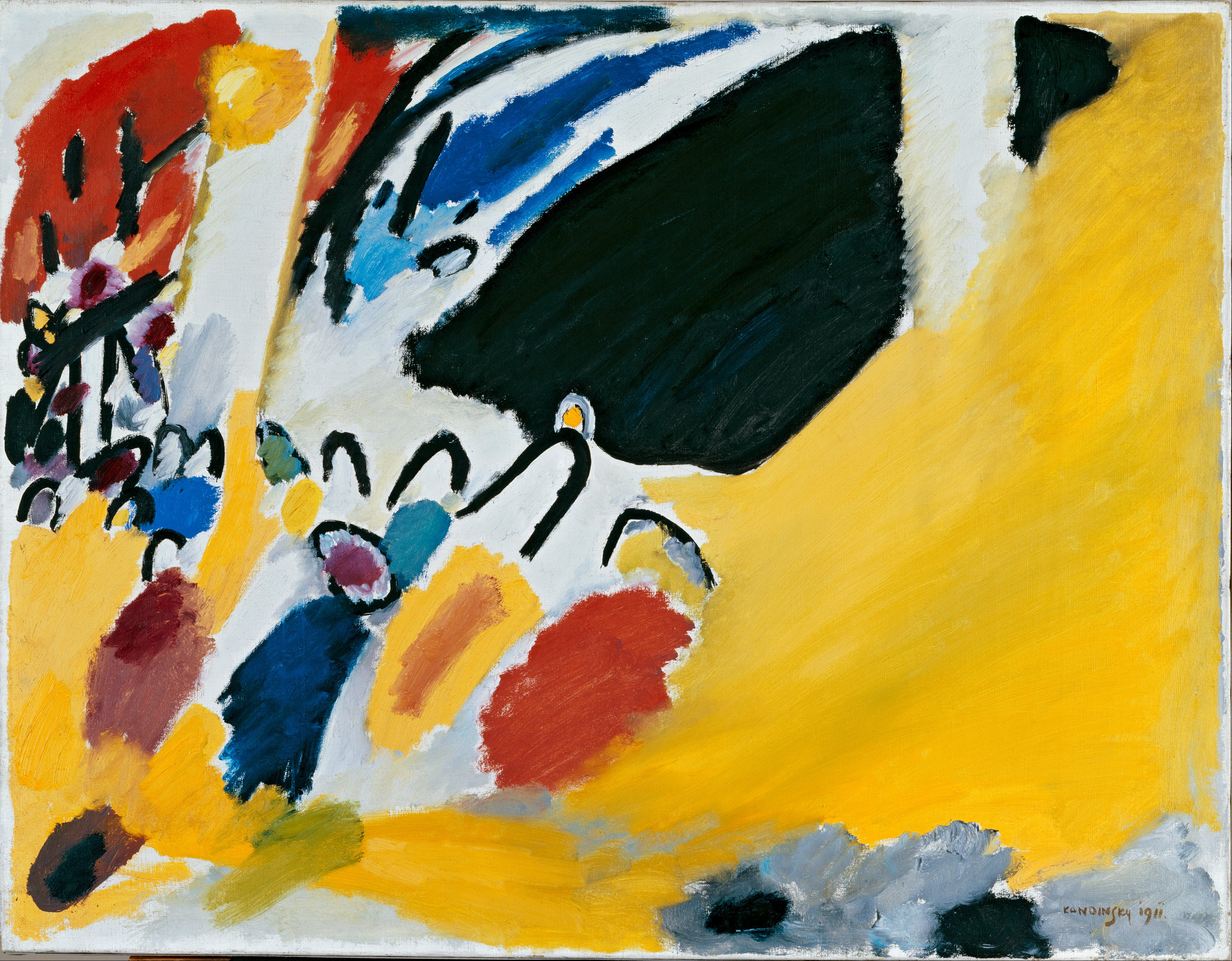
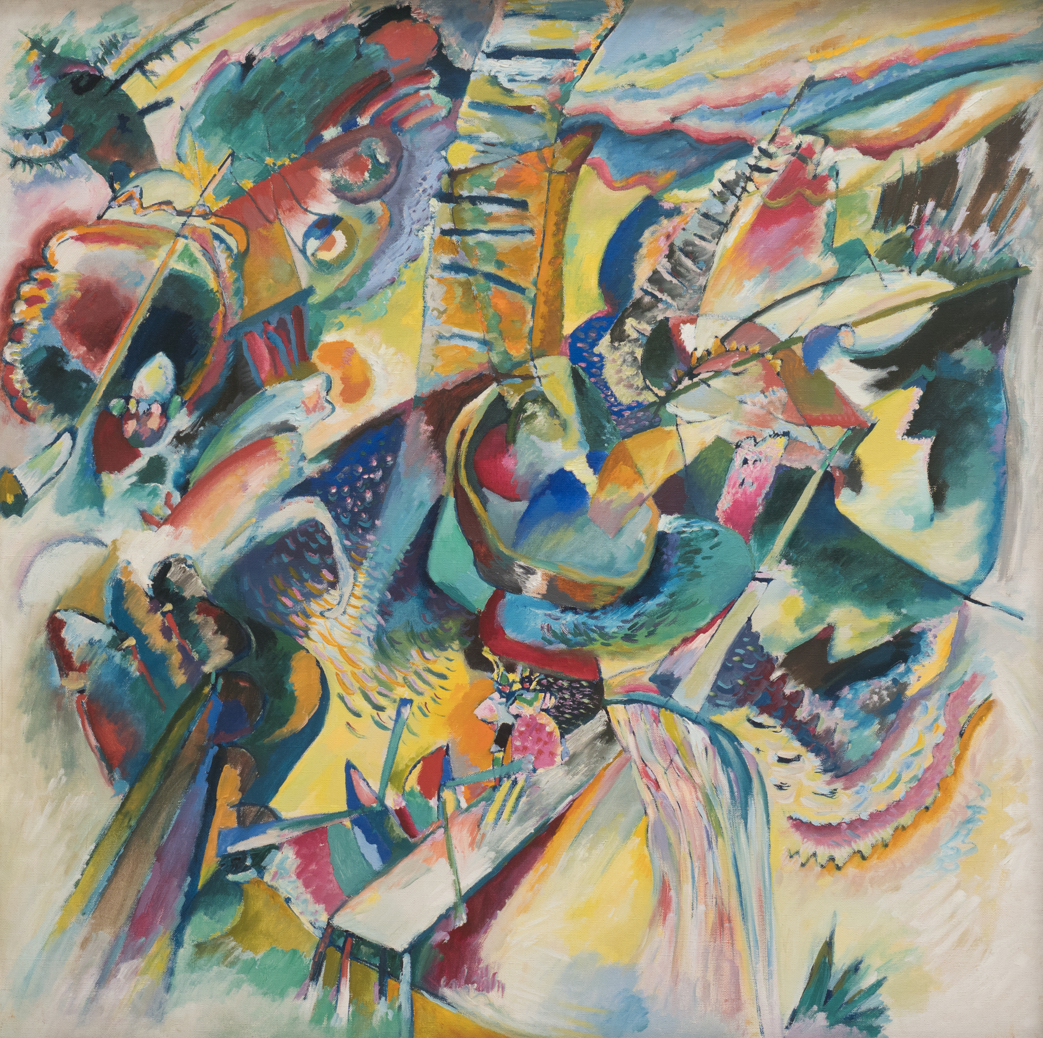
Before selecting a canvas, it is essential to distinguish the major creative periods, as they offer radically different moods for your interior. The famous Composition VIII, painted in 1923 during his teaching at the Bauhaus, is a masterpiece of cold geometry where perfect circles and straight lines are organized with architectural precision. Conversely, the Improvisations, created earlier in Munich under the influence of the Der Blaue Reiter group, overflow with emotional lyricism where forms seem to float in a liquid, colored space. Choosing one or the other comes down to deciding whether you want to structure your room with rigor or animate it with controlled fantasy.
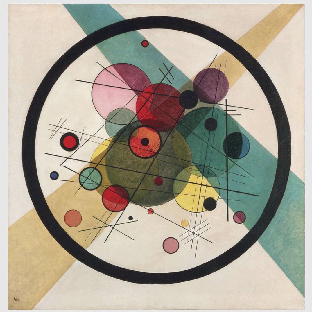
Yellow-Red-Blue, another monument from 1925 housed at the Centre Pompidou, perfectly illustrates the use of primary colors as a universal language, ideal for energizing a creative workspace. Several Circles, on the other hand, focuses all attention on spherical interaction, creating a hypnotic effect that works wonderfully in an entrance or narrow hallway. The works from the Parisian period, more biomorphic and gentle, are better suited for bedrooms or relaxation spaces where one seeks a less aggressive abstraction. Knowing these distinctions helps avoid the stylistic mistake of hanging a tormented composition where visual rest was expected.
Art & details
Circles, lines, tensions: reading Kandinsky without pretending to hear the triangles

Deciphering Kandinsky's visual vocabulary requires understanding that the circle is not a simple geometric form, but for the artist, the synthesis of the greatest oppositions. In Several Circles, each sphere has its own color temperature and its own gravity, creating invisible orbits that attract or repel the viewer's gaze. The black lines, often fine and sharp, serve as the skeleton of the colored edifice, tracing rapid trajectories that prevent the eye from falling asleep on a uniform flat area. A good reproduction must restore this surgical sharpness of the line; otherwise, the dramatic tension of the work dissolves into an unintended artistic blur.
The musicality of the work lies in how the colors resonate with each other, the yellow advancing toward the viewer while the blue recedes into infinite depth. Kandinsky theorized these interactions in his foundational work On the Spiritual in Art, explaining how a bright red can sound like a fanfare against the melancholy of an olive green. When you observe a reproduction, look for this vibration: contours must be frank, color transitions precise, and the whole must give the impression of being about to move. If the forms seem glued together without this breathing space, then the operative magic of the composition has been lost along the way.
Art & details
Blue rider, Russia, Bauhaus: which Kandinsky do you want to hang?
The Der Blaue Reiter period, around 1911-1914, marks the explosive beginnings of abstraction where colors are used for their pure emotional charge, far from any realistic description. The canvases from this era, often inspired by Bavarian landscapes or the Russian icons of his childhood in Moscow, possess an organic warmth and a freedom of line that sometimes recalls the raw energy of Franz Marc. Opting for a reproduction from this era is choosing a bohemian and passionate ambiance, ideal for a living room where you entertain often and where conversation should remain fluid and lively. The forms are less rigid, more intuitive, as if the painting were still finding its way before the great structuring to come.
Conversely, Kandinsky's arrival at the Bauhaus in 1922 marks a turn toward constructivist rigor, influenced by his colleagues such as Paul Klee or László Moholy-Nagy. The works from this German decade are manifestos of clarity, where each element has a precise function in the overall economy of the painted surface. This is the perfect choice for an architect's office, a modern art gallery, or any space requiring orderly intellectual stimulation. Finally, the last Parisian period, more dreamlike and populated with floating biological forms, brings a touch of surrealist poetry that softens overly austere interiors without ever falling into decorative cuteness.
Art & details
Format and room: Kandinsky loves space, but not necessarily the whole wall

The choice of format is crucial because Kandinsky's abstraction requires distance to be fully appreciated, much like stepping back to hear a symphony orchestra. A large format, often exceeding one meter in width, is essential for complex compositions like Composition VIII, so that the multiple geometric details do not turn into a visually illegible mush up close. In a spacious living room with a high ceiling, such a centerpiece can occupy an entire wall above a low sofa, creating an impressive vertical anchor. However, in a smaller space, it is better to favor more concentrated works like Several Circles, which function as optical jewels even at a medium scale.
The location in the house also dictates the format: a narrow hallway does not support an overly horizontally loaded composition, preferring a verticality that accompanies the movement of passage. For an office, a medium format allows keeping the work in the peripheral field of vision without it becoming an exhausting source of distraction. One must always leave a breathing margin around the painting, a space of bare wall that acts as a necessary silence between two musical phrases. Hanging a reproduction that is too small on a huge wall risks making it appear timid and lost, while a format that is too gigantic in a cramped corner creates counterproductive visual oppression.
Art & details
What colors to live with without turning the living room into a visual fanfare?

Kandinsky being a master of color, the dialogue with the wall environment is decisive to avoid an unpleasant sensory overload. Off-white, warm gray, or sand-beige walls provide the ideal neutral backdrop, allowing the bright reds, cobalt blues, and lemon yellows of the work to explode with their native intensity. A wall already painted in royal blue or emerald green would directly compete with the painting's palette, annihilating its contrasts and blurring its legibility. The goal is to create a discreet setting that highlights the chromatic virtuosity of the reproduction without trying to compete with it through ill-advised architectural audacities.
The surrounding furniture also plays a moderating role: natural materials like light wood, oak, or walnut bring an earthy warmth that anchors the ethereal lightness of abstraction. Elements in black metal or glass can echo the strict Bauhaus lines present in certain compositions, reinforcing the stylistic coherence of the room. Avoid upholstery fabrics with overly pronounced floral or geometric patterns that would visually struggle with the forms of the painting. A monochrome approach for the sofa and curtains, simply enhanced by a few cushions in tones subtly echoing those of the work, is enough to create a sophisticated and thoughtful harmony.
Art & details
Why an abstract reproduction must absolutely not become flat

The major pitfall of modern reproductions lies in their tendency to flatten the material, transforming a painting rich in textures into a simple, smooth, soulless digital image. Kandinsky often applied paint in superimposed layers, creating visible thicknesses where light plays on the reliefs, even in his most geometric works. A quality reproduction must attempt to restore this density, either through a high-definition printing technique on textured canvas or through a hand-painted copy by a skilled artist. Without this notion of grain and depth, the circles lose their volume and the lines their sharpness, giving the impression of a stuck-on poster rather than a work of art.
Color accuracy is equally critical, as even a minimal shift in saturation can completely alter the energetic balance of the composition. A red that leans toward orange or a blue that slightly greens can break the tension calculated by the artist between the opposing forces of the canvas. It is imperative to check that the blacks are deep and matte, not grayish or shiny, as they constitute the structural framework of the whole. A successful reproduction gives the illusion that the paint has been freshly applied, preserving that spontaneity and gestural urgency that characterize Kandinsky's genius.
Art & details
What to ask the workshop before ordering
Before finalizing any order, demand to see high-resolution photographs of the original work used as a source, ideally from recognized museums such as the Guggenheim or the MoMA. A pixelated image or one from an old printed book will inevitably lead to a loss of fine details, making small lines and micro-variations of color invisible on the final rendering. Also question the workshop about the type of support used: a museum-quality linen or cotton canvas is preferable to cheap synthetics that age poorly and stretch the paint artificially. The mention of the pigments used is also a guarantee of seriousness, ensuring that the colors will not fade prematurely under the effect of ambient light.
Do not hesitate to ask for quality control proofs, such as a photo of the finished reproduction before shipping, to check the framing and faithfulness of the shades. Ask about the finishing: are the edges of the canvas painted to allow hanging without a frame, or should specific framing be planned? If you opt for a hand-painted copy, inquire about the drying time and protective varnishes applied to ensure the durability of the work. A serious professional will be transparent about these technical aspects, aware that a Kandinsky reproduction is an aesthetic investment that engages the credibility of your interior decoration over the long term.
Interior decoration
Classic mistakes with Kandinsky, or how to avoid unauthorized decorative chaos

The most frequent error is choosing a format that is too timid for a complex composition, thus reducing a visual symphony to a mere insignificant background noise. A Composition VIII reduced to thirty centimeters in width becomes illegible, its hundreds of elements merging into a confused mass that loses all its intellectual and decorative interest. Similarly, installing a work with explosive colors in a room already saturated with objects, patterned rugs, and various knick-knacks creates a visual cacophony that is tiring for the eye. Kandinsky needs space to breathe and impose his authority; stifling him in a baroque or cluttered setting is like drowning out his voice with an unnecessarily distracting ambient noise.
Another major pitfall is neglect of lighting: placing an abstract painting in permanent shadow or under a single overly aggressive spotlight distorts its perception. Diffuse natural light is ideal for revealing the subtle nuances of blues and reds, while poorly directed artificial lighting can create annoying reflections on the surface, especially if the varnish is glossy. Finally, beware of digitally over-saturated reproductions, which transform the artist's subtlety into a cheap pop art caricature. Respecting the integrity of the original work, in its exact proportions and tonalities, is the only guarantee of authentically integrating the master of abstraction into your daily life.
| Room | Suggestion | Decorative effect |
|---|---|---|
| Living room | A work related to Kandinsky painting reproduction with a strong composition | Sophisticated, warm focal point, easy to comment on without reciting a label. |
| Bedroom | A soft palette or a more intimate scene | Calm atmosphere, visual presence without unnecessary agitation. |
| Office | A structured, colorful, or graphically sharp image | Creative energy and a small reminder that the wall can also work. |
| Entrance | A vertical format or an immediately readable work | Clear, elegant first impression, and decidedly less timid than a blank white void. |
To continue the visit
Sources, collections, and paths truly related to the subject
A few useful references to verify information, compare free images, and extend the reading without going to a museum that didn't ask for anything.
Related articles to read next
Useful blog hubs
FAQ
Frequently asked questions about Kandinsky painting reproduction
What is Kandinsky painting reproduction in painting?
A reproduction of a Kandinsky painting must preserve the rhythm, the tension of the lines, the accuracy of colors, and the abstract balance: if everything becomes flat, the visual orchestra starts playing out of tune.
How to quickly recognize this style?
Observe above all circles, lines, geometry, primary colors, and rhythm, then the way the composition organizes the gaze. If the work holds your attention longer than expected, it is probably not an accident.
What artists should you know?
The main references are Wassily Kandinsky, Franz Marc, Paul Klee, Gabriele Münter, and László Moholy-Nagy.
Is this style suitable for modern decoration?
Yes, provided you choose the right format, a palette consistent with the room, and a work whose presence remains pleasant on a daily basis.
Should you choose the most famous work?
Not necessarily. The most famous work can be perfect, but the right choice depends above all on the room, the format, the palette, and the atmosphere sought.
Where to verify the information?
Start with museum notes, Wikipedia/Wikidata for general orientation, then Wikimedia Commons when a free image is needed.
Abstraction as a daily life companion
Choosing a Kandinsky reproduction is, ultimately, accepting to live with a question rather than an answer, letting geometric forms and primary colors question our perception every day. Whether it is the architectural rigor of the Bauhaus or the lyrical freedom of his early years, the work brings a spiritual and dynamic dimension to the modern interior. By respecting the rules of space, light, and artistic fidelity, you transform a simple wall into a stage where the music of the spheres plays eternally. So let these circles turn and these lines fly, for they, after a century of existence, still have much to teach us about the balance of the world.
0 comments