

Which Van Gogh painting to choose for your decor? The guide that looks beneath the varnish
Navigating between the sunflowers of Arles and the starry night of Saint-Rémy to find the artwork that resonates with your interior, without falling into the postcard cliché.
Vincent van Gogh is not simply a prestigious name to hang on a wall to look serious; he is an ambient temperature, a sonic vibration, and a shifting mood depending on the time of day. Choosing a reproduction of this Dutch artist demands more than an impulsive crush in front of a catalog: you must understand that each canvas has its own climate, from the blinding sulfur yellow of the Provençal wheat fields to the deep, tormented blue of the Saint-Rémy nights. Some paintings light up a room like a winter fireplace, while others wake it up with the intensity of an overly short but terribly invigorating espresso. This article invites you to move beyond the artist's mere fame to enter the very flesh of his painting, where the brushstroke dictates the rhythm of your interior decoration.
 Free image
Navigating between the sunflowers of Arles and the starry night of Saint-Rémy to find the artwork that resonates with your interior, without falling into the postcard cliché.
Reading method
The sensory approach to decor
Before selecting a work, set aside rigid chronological classifications and focus on the physical reaction the image provokes. Observe how the pictorial material interacts with the light of your living room or the quiet of your bedroom, because it is this visual alchemy that will transform a simple decorative object into a lifelong companion.
Context before prestige
We place which Van Gogh painting to choose for your decor in its time period, its studios, its exhibitions and its small revolts. A work without context is sometimes just a very beautiful person who has forgotten their story.
The clues that betray the style
We spot composition, palette, texture. These clues often say more than grand speeches, especially when they carry gold or nervous brushstrokes.
The work in a real room
We end with the useful question: does this image breathe in your home, or does it merely pose like a poster that has read two books?
Historical context
Where does the Van Gogh obsession come from, and why is it more than just a pretty label?

To grasp the decorative power of Van Gogh, we must go back to his Parisian years in 1886, when he discovered Impressionism and abandoned his earthy Dutch tones for a luminous palette. It was only upon arriving in Arles in February 1888, dazzled by the light of the South, that he developed this unique style of pure colors and outlined contours, transforming ordinary reality into an electric vision. Understanding this rupture is essential when choosing a work: a canvas painted during this explosive period will not exude the same energy as a darker landscape produced during his stay in Auvers-sur-Oise in 1890.
The historical context also reveals that Van Gogh painted with a feverish urgency, often outdoors, capturing the present moment with an intensity that endures through time. His studios, whether the Yellow House rented in Arles or the room at the Saint-Rémy asylum, were laboratories where every brushstroke was an affirmation of life in the face of inner turmoil. Thus, hanging a reproduction at home means inviting this story of resilience and radical transformation into your private space, going well beyond a simple passing aesthetic trend or a superficial decorative effect.
Artistic style
Why does Van Gogh's work still appeal so strongly to our modern interiors?

The persistence of the fascination for Van Gogh in contemporary décor stems from his unique ability to humanize space through the very material of painting. Unlike the smooth digital images that dominate our daily lives, his canvases offer a palpable texture, a relief created by impasto that gives volume to the wall and creates a play of shifting shadows depending on the room's lighting. This physicality brings organic warmth to interiors that are often minimalist or sterile, acting as a tactile reminder of the artist's hand and his violent or caressing gesture depending on the moments of his short career.
Moreover, the universality of the subjects treated, from wheat fields to intimate bedrooms, allows everyone to project their own story in front of the work without feeling excluded by intellectual hermeticism. Whether it is the soothing solitude of a starry night or the overflowing vitality of a blooming orchard, these images speak a direct emotional language that transcends centuries and cultures. Choosing Van Gogh is therefore opting for a décor that does not merely fill a wall void, but that engages a silent and profound conversation with the inhabitants of the house, day after day.
Visual signs that betray style and guide the choice

Recognizing a Van Gogh canvas at first glance relies on identifying his inimitable gestural signature, that divided touch that makes color vibrate rather than blending it on the palette. We often observe short, parallel or swirling strokes, applied with such thickness that the paint seems sculpted, creating perpetual movement even in the most static subjects like cypresses or mountains. For décor, it is crucial to note that this visual agitation can energize a room that is too calm, while a more structured composition will bring rhythm without necessarily creating nervous turbulence in the general atmosphere.
The color palette constitutes the second major indicator, oscillating between bold complementary harmonies, like cobalt blue facing chrome yellow, and the more muted ranges of periods of doubt. From a decorative standpoint, one must be aware that certain works, dominated by acidic greens or vermilion reds, possess such saturation that they can alter the perception of surrounding colors in the room. A canvas with bluish dominant tones will tend to visually cool the space, ideal for a bedroom, while an explosion of yellows and oranges will act as a luminous radiator in a north-facing or poorly naturally lit living room.
Works to look at as if they were going to respond to your space

Among the major works, The Starry Night, painted in June 1889 from the window of the Saint-Rémy asylum, imposes a tumultuous sky where the stars become vortices of liquid light. This canvas, kept at the MoMA in New York, exudes a cosmic and almost hypnotic energy perfectly suited to a creative office or a space for reflection where one seeks to stimulate the imagination. However, its dramatic intensity and aggressive curves might seem oppressive in a small entryway or bathroom where one seeks above all serenity and immediate relaxation after a long day.
Conversely, the Sunflowers series, created in Arles between 1888 and 1889, offer a celebration of Mediterranean light captured in the humble simplicity of cut flowers in a vase. These compositions, visible notably at the National Gallery in London or at the Van Gogh Museum in Amsterdam, radiate a benevolent warmth and compositional stability that make them ideal candidates for a dining room or kitchen. The dominant yellow acts as an antidote to winter gloom, bringing a note of contained cheerfulness that integrates harmoniously into classic or contemporary decors without outrageously dominating the space.
Symbols, details and small visual quirks to decipher
Beyond immediate beauty, Van Gogh's paintings are full of recurring symbols that enrich the reading of the work once installed in an interior. The cypress, for example, present in many Saint-Rémy landscapes such as Wheat Field with Cypresses, was seen by the artist as a black line connecting earth to sky, a symbol of mourning but also of eternity. Integrating such an image into a living room means accepting this melancholic and spiritual duality, adding a narrative depth to the decor that invites slow contemplation rather than a distracted, fleeting glance as one passes through the room.
Clothing details in portraits, such as those of Postman Roulin or Madame Ginoux, also reveal a particular attention to fabric textures and facial expressions frozen in a rare psychological intensity. These portraits are not simple physical representations but character studies where every fold of clothing and every feature of the face tells a laborious and dignified life. Hanging such a portrait in a reception area gives a strong human presence, as if the silent guest observed comings and goings with kindness, anchoring the decor in a tangible social and historical reality.
Neighbors, allies, and turbulent cousins of the Van Gogh universe

Although Van Gogh is a singular figure, his artistic dialogue with Paul Gauguin during their turbulent cohabitation in Arles in 1888 produced works that resonate with each other through their use of pure color. If one is looking for a slightly different alternative for one's decor, Gauguin's works from this period offer larger areas of flat color and more pronounced outlines, creating a more mystical and less tormented atmosphere than that of his volcanic friend. Understanding this proximity makes it possible to envision bold wall associations, juxtaposing two visions of Post-Impressionism that respond to each other while retaining their distinct, strong artistic personalities.
The influence of Japanese printmaking must also be mentioned, omnipresent in Van Gogh's work after his discovery of it in Paris, visible in the off-center framings and the absence of cast shadows in certain canvases. This opening toward the Orient introduces a notion of space and emptiness that can pair perfectly with clean, modern interiors inspired by contemporary Japanese minimalism. Choosing a work where this influence is strong, such as certain blossoming almond branches, brings a touch of refined exoticism and airy lightness that contrasts pleasantly with the heaviness sometimes associated with traditional 19th-century European painting.
What museums confirm when shortcuts go too far

Visiting institutions such as the Musée d'Orsay in Paris or the Kröller-Müller Museum in the Netherlands, whether virtually or in person, makes it possible to realize the actual scale of the works, often more modest than one imagines thanks to giant reproductions. A canvas like Bedroom in Arles measures about 72 cm by 90 cm, an intimate format that works wonderfully in a domestic setting without overwhelming the surrounding furniture with monumentality. This discovery is crucial to avoid the common mistake of ordering an oversized reproduction that would smother the room, when the artist designed his paintings to be seen up close, in the proximity of the gaze.
Museums also reveal the state of color conservation, showing how certain pigments have evolved or how old varnish could yellow the whole before recent restorations. Seeing the original makes it possible to understand the true luminosity of the blues and greens, sometimes altered in cheap prints that lean toward gray or brown. For a quality reproduction purchase, it is therefore essential to rely on high-definition scans from these official museum collections, ensuring chromatic fidelity that respects Vincent van Gogh's initial luminous intention.
How to choose a reproduction without making the wall panic?

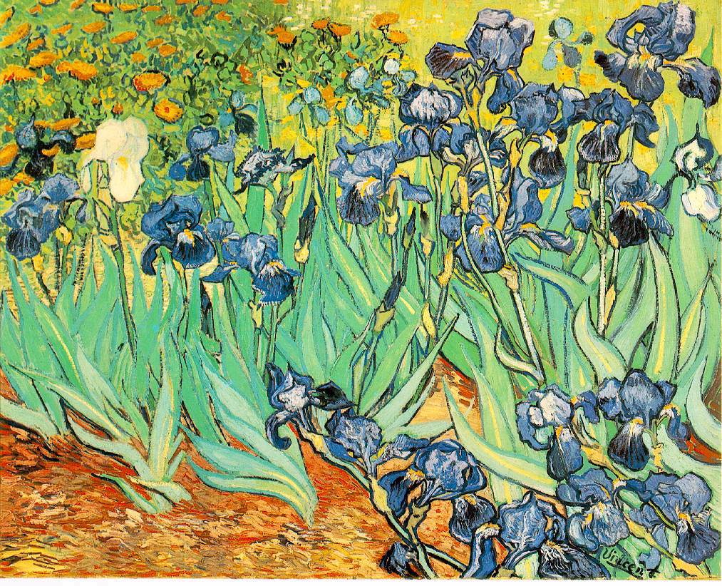
The successful integration of a Van Gogh depends above all on the harmony between the canvas's palette and the dominant tones of the room, whether wall color, flooring, or upholstery fabric. If your living room features neutral tones like off-white, pearl gray, or sandy beige, a vividly colored work such as Irises or a field of poppies will become the natural focal point, bringing the touch of life needed without creating chaotic visual dissonance. Conversely, in a space already very colorful or full of patterns, it will be wiser to opt for a more sober composition, perhaps a portrait on a plain background or a winter landscape, to avoid unpleasant sensory saturation.
Format and frame also play a determining role in the final balance: a stretched canvas reproduction without a frame offers a modern, immersive look, while a golden or dark wood frame will anchor the work in a classical tradition. For a bedroom, favor horizontal formats that guide the eye in the direction of rest, like a plain view, whereas for an entrance hall or staircase, a vertical format with slender elements such as cypresses or fruit trees will echo the architectural verticality of the space with elegance and dynamism.
Interior decor
Mistakes to avoid before hanging the painting permanently

The most common mistake is choosing a work solely for its iconic fame without considering its everyday emotional impact within the intimacy of your home. Living with a reproduction of Munch's The Scream is one thing, but coexisting with the tormented version of The Starry Night or a wheat field under a stormy sky requires a certain tolerance for the visual anxiety these images can generate over time. It is wise to test the effect of the image by temporarily printing it out or visualizing it through an augmented reality app to ensure that the intensity of the pictorial gesture does not become a source of nervous fatigue after a few weeks of constant exposure.
Finally, neglecting the dedicated lighting for the work is a major lapse in taste that can transform a masterpiece into a dark blot or, conversely, create distracting reflections on the varnished surface. A Van Gogh canvas, with its impasto reliefs, deserves raking or directional lighting that accentuates the texture of the paint and makes the microscopic shadows created by the brushstrokes dance. Investing in a small adjustable spotlight or placing the work facing an indirect natural light source will reveal the full material richness of the image, turning a simple wall decoration into a dynamic and lively visual experience.
| Room | Suggestion | Decorative effect |
|---|---|---|
| Living room | A work related to Which Van Gogh painting to choose for your decor with a strong composition | Cultivated focal point, warm and easy to comment on without reciting a wall label. |
| Bedroom | A soft palette or a more intimate scene | Calm atmosphere, visual presence without unnecessary agitation. |
| Office | A structured, colorful, or graphically sharp image | Creative energy and a little reminder that the wall can work too. |
| Entryway | A vertical format or an immediately readable work | First impression, clear, elegant, and noticeably less shy than an empty white wall. |
To continue the visit
Sources, collections, and paths truly related to the subject
A few useful references to verify the information, compare the free-to-use images, and keep reading without wandering off to a museum that never asked for it.
Related articles to read next
Verified collections
Useful blog hubs
Reliable sources on this subject
- Wikipedia - art and context for Which Van Gogh painting to choose for your decor
- Wikidata - visual arts for Which Van Gogh painting to choose for your decor
- Wikimedia Commons - art for Which Van Gogh painting to choose for your decor
- The Met - Heilbrunn Timeline of Art History
- Tate - Art terms
- Musée d'Orsay - collections
FAQ
Frequently asked questions about Which Van Gogh painting to choose for your decor
What is Which Van Gogh painting to choose for your decor in painting?
Which Van Gogh painting to choose for your decor deserves a full-length article because this style engages an era, a way of painting, and a very concrete way of living with images.
How to recognize this style quickly?
Focus especially on composition, palette, texture, light, and atmosphere, then the way the composition organizes the gaze. If the work holds you longer than expected, it's probably not an accident.
Which artists should you know?
You should cross-reference the central artists of the movement with museums and reliable sources to avoid hasty attributions.
Is this style suitable for modern decor?
Yes, provided you choose the right format, a palette that harmonizes with the room, and a work whose presence remains pleasant day to day.
Should you choose the most famous work?
Not necessarily. The best-known work may be perfect, but the right choice depends above all on the room, the format, the palette, and the atmosphere you're looking for.
Where to verify the information?
Start with museum entries, Wikipedia/Wikidata for general orientation, then Wikimedia Commons when a free-to-use image is needed.
Living with Van Gogh every day
Choosing which Van Gogh painting to incorporate into your decor is an act that goes beyond the simple acquisition of an aesthetic object; it is the invitation of a vibrant, human presence into your living space. Whether you are drawn to the softness of almond trees in bloom or to the telluric force of Provençal landscapes, what truly matters is the personal resonance the work establishes with your living space. By paying attention to historical details, the quality of the reproduction, and chromatic harmony, you will transform your wall into a window open to one of the most brilliant and sensitive minds in the history of art. Let Vincent's nervous brushstroke converse with your everyday life, bringing color, movement, and infinite poetry to your interior.
0 comments