

Abstraction · colour · Bauhaus · interiors
Kandinsky reproductions: famous works, colour and interior advice
In Kandinsky, a circle is never isolated and a line is never still. Every shape answers the others like an instrument inside a musical composition.
Periods, famous paintings, dimensions, colour, reproduction quality and room placement: these practical landmarks help you choose a work that remains strong without overwhelming the space.

Choose before buying
The right Kandinsky depends on the effect you want
A “Kandinsky reproduction” is not one single atmosphere. The still recognisable landscapes of Murnau, the lyrical Improvisations, the large Compositions and Bauhaus geometry create very different experiences. Some paintings are warm and organic; others structure space through circles, angles and taut lines.
Begin with the room. A large living space can hold a complex composition whose details need distance. An office often benefits from a more constructed work that adds energy without scattering attention. In a bedroom, a concentrated palette and fewer shapes provide a calmer presence.
The artist’s name attracts attention, but the relationship between image, wall, dimensions and light determines everyday success. An excellent reproduction that is too small loses its tension; an oversized canvas inside an already crowded room becomes tiring.
Identify the period
Landscape, lyrical abstraction and Bauhaus geometry create different energy and density.
Measure complexity
The more numerous the signs, the more generous the format and viewing distance should be.
Check the reproduction
Crisp lines, accurate colour, clean fields and coherent material are essential.
Four languages, four moods
From Murnau landscapes to Bauhaus geometry
The dates below are practical landmarks rather than rigid borders. Kandinsky’s visual language evolved through overlapping experiments.
| Period | Visual signs | Mood | Suggested space |
|---|---|---|---|
| Murnau and Munich, c. 1908–1910 | Coloured landscapes, simplified buildings, strong outlines and liberated perspective. | Expressionist warmth still connected to the visible world. | Living room, library or an interior mixing old and new. |
| Der Blaue Reiter, 1911–1914 | Dissolving forms, diagonals and large chromatic centres. | Lyrical movement, spiritual tension and improvisation. | Reception room, studio or a clear central wall. |
| Russia, 1914–1921 | A transitional vocabulary, free forms and graphic research. | Experiment between Russian memory and constructed abstraction. | Eclectic interior with modern art and books. |
| Bauhaus, 1922–1933 | Circles, triangles, lines, grids and clear contrasts. | Architectural rhythm, modernity and active balance. | Office, contemporary living room or minimalist wall. |
| Paris, 1933–1944 | Biomorphic shapes, subtler colour and floating figures. | A more intimate, organic or cosmic abstraction. | Bedroom, reading corner or quieter space. |
Music as a model
Kandinsky did not merely paint colourful shapes
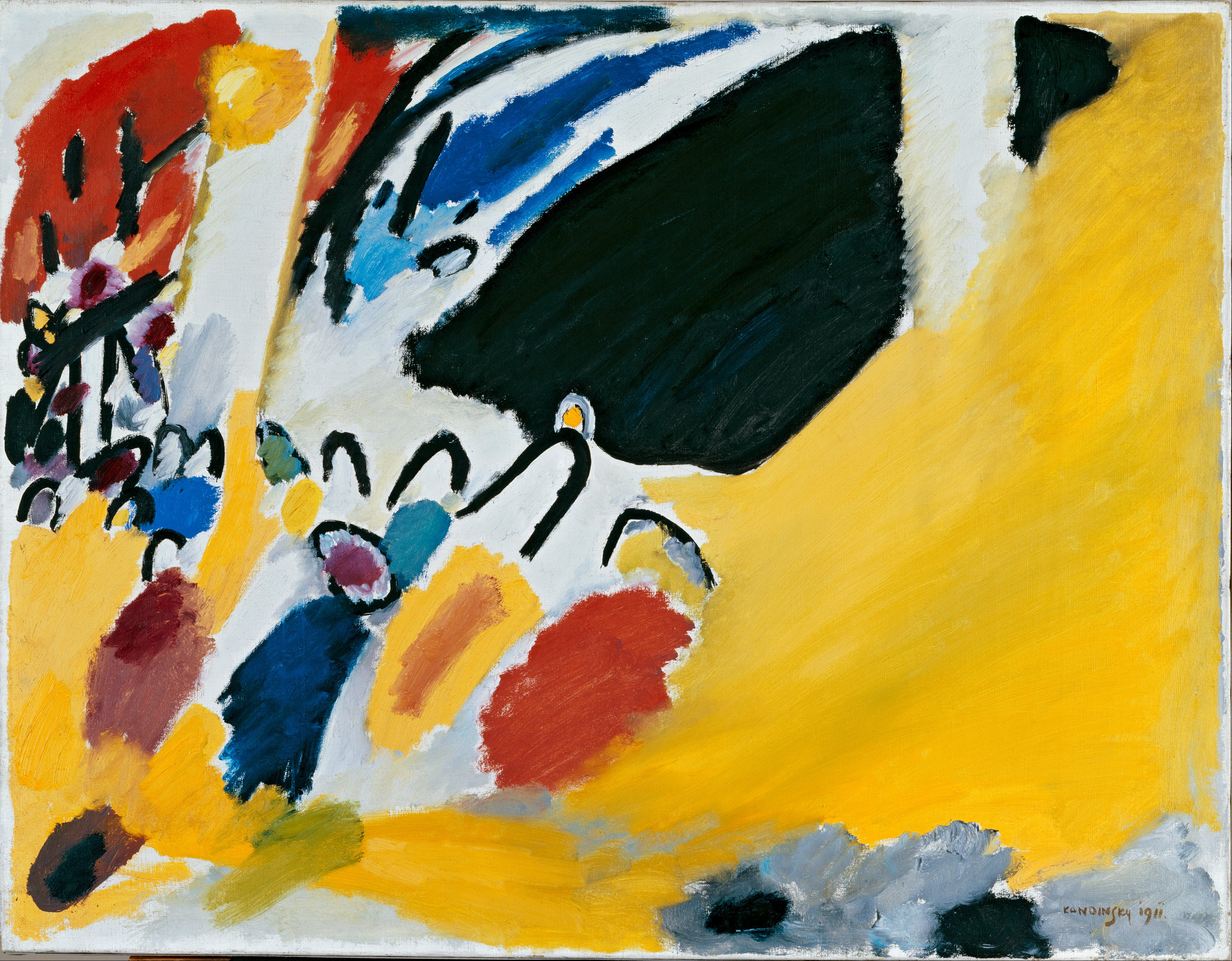
The composition organises forces rather than objects
Kandinsky wanted painting to act directly, without depending on an identifiable story. He frequently compared colour and music: yellow can advance, blue can recede, an oblique line can accelerate the eye and a circle can hold the whole composition together.
A reproduction must preserve those relationships. If blacks become grey, yellows dull or fine lines vanish, the balance changes. An image can look broadly faithful and still lose the rhythm that makes the work alive.
Move through the picture slowly: locate the colour centre, follow a line, notice the empty intervals and return to the whole. Abstraction becomes clearer when we stop asking “what does it represent?” and instead ask “where does it lead me?”
Circles · lines · tension
Three works that reveal Kandinsky’s visual vocabulary
Geometry does not make the painting cold. It gives every element a position, direction and intensity, as a score distributes voices.


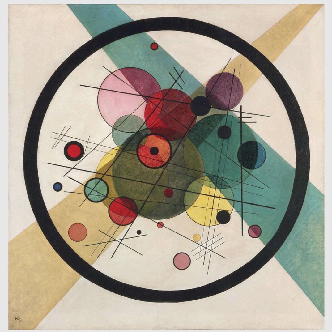
The circle stabilises without becoming still
For Kandinsky, a circle combines concentration and movement. It can float, overlap, absorb light or collide with a line. A triangle concentrates direction; a diagonal accelerates; a horizontal calms; a vertical asserts.
A good reproduction must preserve edges, transparencies and distances. A line thickened by a poor file, a distorted circle or an overly uniform background changes the whole relationship.
A European trajectory
Five dates in the creation of an abstract language
Born in Moscow
Russian popular culture, icons and an early musical sensitivity contributed to his memory of colour.
Moved to Munich
After studying law, he chose painting and joined a major centre of the European avant-garde.
Der Blaue Reiter
With Franz Marc, he helped connect colour, music, spirituality and artistic renewal.
Teacher at the Bauhaus
At Weimar and Dessau, he examined the relationships between point, line, plane and colour.
Final years in France
After the Bauhaus closed, he settled near Paris and developed a more biomorphic language.
Scale · wall · palette
Place Kandinsky without turning the room into visual noise

Let the artwork provide the main contrast
Off-white, warm grey, mineral beige and natural wood give Kandinsky’s colours a stable ground. A saturated wall can work, but the selected picture should not compete with its dominant hue.
A complex composition should not be reduced too far. At a very small size, lines and microforms merge into a coloured signal. Above a sofa, a width close to two-thirds of the furniture often creates a stable relationship. Test the outline with removable tape before ordering.
Limit competing patterns nearby. A graphic rug, multicoloured cushions, crowded shelves and a gallery wall can smother the canvas. Kandinsky accepts dialogue with modern forms, but needs a clear interval around the work.
Active shop selection
Five reproductions for choosing your Kandinsky
These active products cover geometry, circles, chromatic construction, improvisation and a work still connected to landscape.

Composition VIII
Circles, angles and lines whose balance depends on graphic precision.

Circles in a Circle
A concentrated composition well suited to an office or contemporary room.

Yellow-Red-Blue
An expansive painting for making colour the centre of a living room.

Deluge Improvisation
A more organic option for viewers who prefer free energy to strict geometry.

Kochel — Waterfall I
A Kandinsky still linked to landscape and easy to place in a warmer interior.
Explore without getting lost
Six important shop collections
The Kandinsky collection contains 384 active works checked on 14 July 2026. The other pages extend the search by movement, degree of abstraction and interior use.
Wassily Kandinsky
Landscapes, Improvisations, Compositions, circles and Bauhaus research.
935 worksAbstract art
Geometry, colour, gesture and non-figurative composition.
2,682 worksExpressionism
Expressive colour, distortion and emotional intensity.
118 worksAbstract Expressionism
Extend the search towards gesture and post-war American painting.
392 worksPaintings for living rooms
Compare dimensions, palettes and focal works for the main room.
1,679 worksFamous paintings
Place Kandinsky among major landmarks of art history.
Institutional records
Four sources for checking works and periods
Centre Pompidou
Works and resources connected to the major French national collection.
New York · major collectionGuggenheim Museum
Artwork records, chronology and an especially rich abstract-period collection.
New York · modern artMoMA
Dates, techniques and documentation on Kandinsky’s place in modernism.
London · artist resourceTate
A concise introduction, associated works and further resources.
Ten precise answers
Frequently asked questions about Kandinsky reproductions
What is Kandinsky’s most famous painting?
Composition VIII, Yellow-Red-Blue, Several Circles and Composition VII are among his best-known works. The right interior choice still depends on period, dimensions and palette.
How can I quickly recognise Kandinsky’s style?
Look at relationships between colour, line and form: circles, diagonals, triangles, floating signs and contrasts often organise a rhythm without relying on an identifiable subject.
Which period best suits a modern interior?
The Bauhaus period naturally fits contemporary spaces through clear geometry. Improvisations suit rooms that need freer, more organic energy.
What size should I choose for Composition VIII?
The work contains many fine details. A generous format preserves spacing, lines and visual breathing room. Test the outline on the wall and allow viewing distance.
Which wall colours work with Kandinsky?
Off-white, warm grey, mineral beige and natural wood generally allow the palette to breathe. A coloured wall can work if it does not compete with the painting’s dominant tones.
Is a printed reproduction enough?
A good print can reproduce forms precisely. A hand-painted version adds material variation. The important point is that the technique is clearly stated and well executed.
What should I check in a reproduction?
Check line sharpness, circle shapes, black depth, transparency, colour accuracy, image ratio and the quality of the support.
Can Kandinsky work in a bedroom?
Yes, with a less crowded composition, concentrated palette and proportionate format. Certain circle works and late Paris paintings create a quieter presence.
How should I light the canvas?
Use soft oblique light and avoid direct sunlight. Very frontal light can flatten nuances, while warm bulbs can significantly alter yellow, red and blue.
Where can I see all available reproductions?
The Wassily Kandinsky collection brings together active shop works across different periods, colours and formats.
0 comments