

16th - 20th centuries · oil paintings
The 100 paintings orange the most famous
One hundred paintings where amber, orange ocher, vermilion, copper, tangerine and incandescent orange actually construct the image - from Monet and Van Gogh to Matisse, Munch, Kandinsky and Pollock.

Between red, yellow and light
How did orange ignite the paint?
Orange occupies a passage zone. It arises from the vicinity of red and yellow, but is never reduced to their simple addition: more earth leads it towards ocher and rust, a hint of red towards vermilion, more yellow towards gold and 'apricot. Depending on its thickness, it can be opaque like a fabric, transparent like a sunset or shiny like copper. This mobility allows it to embody heat, matter and light.
Before the word "orange" commonly referred to a chromatic category in Europe, painters spoke mainly of red yellows, earths, minium or cinnabar. In the 19th century, chromium and then cadmium pigments broadened the range and offered more frank tones. Monet, Van Gogh and Munch especially discovered its relational power: placed near blue, orange seems to radiate; surrounded by reds and browns, it becomes embers, autumn or flesh.
In the 20th century, Matisse transformed this heat into a decorative surface, Kandinsky into abstract tension and Pollock into the circulation of energy. This classification therefore does not retain paintings where orange appears in a tiny accessory: it must organize the light, the motif or a decisive part of the composition. The hundred works are oil paintings; drawings, inks, pastels, watercolors, prints and photographs are excluded.
Orange does not only describe fire or the sun: it brings shapes together, activates contrasts and gives the canvas its temperature.
Earthy and deep, it connects light to the floor, walls and faces without breaking the unity of brown people.
Warm and intense, it advances towards the eye and gives fabrics, flowers or the sky an immediate presence.
Opaque and saturated, it supports modern solid colors and maintains its shine in contact with blues and purples.
Darker and transparent, they transform color into reflection, heated metal or twilight light.
100 paintings where orange constructs the image
Editorial rankingTwenty images that have become universal
The absolute icons of orange
Claude Monet
Print, rising sun
In "Impression, rising sun", orange does not serve as a decorative accent: it regulates the light, depth and general rhythm of the image. Monet transforms orange into an atmospheric phenomenon: the hue diffuses into the purple mists, water blues and grays of the sky. Orange diffuses instead of closing flat: it crosses the sky, touches the water or the earth and regulates the entire temperature of the landscape. This range directly contributes to the fame of the work: it crosses the sky, touches the water or the earth and regulates the entire temperature of the landscape. This range directly contributes to the fame of the work: it fixes its atmosphere and visual memory.
See reproduction →
Claude Monet
Twilight in Venice
In "Twilight in Venice", orange does not serve as a decorative accent: it regulates the light, depth and general rhythm of the image. Monet transforms orange into an atmospheric phenomenon: the hue diffuses into the purple mists, water blues and grays of the sky. Orange diffuses instead of closing flat: it crosses the sky, touches the water or the earth and regulates the entire temperature of the landscape. This range directly contributes to the fame of the work: it crosses the sky, touches the water or the earth and regulates the entire temperature of the landscape. This range directly contributes to the fame of the work: it fixes its atmosphere and visual memory.
See reproduction →
Vincent van Gogh
Sunflowers
In "Sunflowers", orange does not serve as a decorative accent: it regulates the light, depth and general rhythm of the image. Van Gogh contrasts orange with intense blues and greens; this complementarity gives the canvas an immediate and almost physical vibration. Orange accents respond to each other from one object to another; they give volume to the shapes and prevent the background from remaining inert. This range directly contributes to the celebrity of the work: it fixes its atmosphere and visual memory.
See reproduction →
Vincent van Gogh
Van Gogh's Room in Arles
In "Van Gogh's Room in Arles", orange does not serve as a decorative accent: it regulates the light, depth and general rhythm of the image. Van Gogh contrasts orange with intense blues and greens; this complementarity gives the canvas an immediate and almost physical vibration. The hue does not necessarily occupy the entire canvas: placed at the right point, it is enough to direct the gaze and unify the masses. This range does not necessarily contribute to the fame of the work: placed at the right point, it is enough to orient the gaze and unify the masses. This range does not necessarily occupy the entire canvas: placed at the right point, it is enough to orient the gaze and unify the masses. This range directly contributes to the celebrity of the work: it fixes its atmosphere and visual memory.
See reproduction →
Paul Gauguin
The Yellow Christ
In "The Yellow Christ", orange does not serve as a decorative accent: it regulates the light, depth and general rhythm of the image. Paul Gauguin modulates the orange between ocher, vermilion and amber so that the chromatic heat remains linked to the light and structure. The orange immediately advances towards the eye, while the neighboring blues, greens and browns give it measurable depth. This range directly contributes to the celebrity of the work: it fixes its atmosphere and visual memory.
See reproduction →
John william waterhouse
The Magic Circle
In "The Magic Circle", orange does not serve as a decorative accent: it regulates the light, depth and general rhythm of the image. Waterhouse concentrates orange in fabrics, hair, metal or interior light, then embeds it in deep greens and browns. The composition is based on an exchange between amber areas and some cold accents which prevent the heat from becoming uniform. This range is based on an exchange between amber areas and some cold accents which prevent the heat from becoming uniform. This range is based on an exchange between amber areas and some cold accents which prevent the heat from becoming uniform. This range is based on an exchange between amber areas and some cold accents which prevent the heat from becoming uniform. This range is based on an exchange between amber areas and some cold accents which prevent the heat from becoming uniform. This range is directly linked to the fame of the work: it fixes its atmosphere and visual memory.
See reproduction →
Ivan Aivazovsky
The Ninth Wave
In "The Ninth Wave", orange does not serve as a decorative accent: it regulates the light, depth and general rhythm of the image. Ivan Aivazovsky modulates the orange between ocher, vermilion and amber so that the chromatic heat remains linked to light and structure. The transition from ocher to vermilion produces internal light; dark tones then serve as a frame and counterweight. This range directly contributes to the fame of the work: it fixes its atmosphere and visual memory.
See reproduction →
Camille Pissarro
The Red Roofs, village corner, winter effect
In "Les Toits rouge, village corner, winter effect", orange does not serve as a decorative accent: it regulates the light, depth and general rhythm of the image. Camille Pissarro modulates the orange between ocher, vermilion and amber so that the chromatic heat remains linked to the light and the structure. The color does not necessarily occupy the entire canvas: placed at the right point, it is enough to orient the gaze and unify the masses. This range does not necessarily occupy the entire canvas: placed at the right point, it is enough to orient the gaze and unify the masses. This range directly contributes to the celebrity of the work: it fixes its atmosphere and visual memory.
See reproduction →
Georges Seurat
The Circus
In "Le Cirque", orange does not serve as a decorative accent: it regulates the light, depth and general rhythm of the image. Georges Seurat modulates the orange between ocher, vermilion and amber so that the chromatic heat remains linked to the light and the structure. The orange immediately advances towards the eye, while the neighboring blues, greens and browns give it measurable depth. This range directly contributes to the celebrity of the work: it fixes its atmosphere and visual memory.
See reproduction →
Edvard Munch
The Sun
In "The Sun", orange does not serve as a decorative accent: it regulates the light, depth and general rhythm of the image. Munch shifts the orange from landscape to emotion: foliage, sun and soil become signs of heat, wear or worry. The orange diffuses instead of closing flat: it crosses the sky, touches the water or the earth and regulates the entire temperature of the landscape. This range directly contributes to the fame of the work: it crosses the sky, touches the water or the earth and regulates the entire temperature of the landscape. This range directly contributes to the fame of the work: it fixes its atmosphere and visual memory.
See reproduction →
Salvador Dali
Phantom Cart
In "Phantom Cart", orange does not serve as a decorative accent: it regulates the light, depth and general rhythm of the image. Salvador Dalí modulates the orange between ocher, vermilion and amber so that the chromatic heat remains linked to light and structure. The transition from ocher to vermilion produces internal light; dark tones then serve as a frame and counterweight. This range directly contributes to the fame of the work: it fixes its atmosphere and visual memory.
View work in collection →
Jackson Pollock
Autumn rhythm (Number 30)
In "Rhythm of Autumn (Number 30)", orange does not serve as a decorative accent: it regulates the light, depth and general rhythm of the image. Pollock disperses orange ochres and copper browns in a centerless network, where color preserves the memory of movement. The range changes from yellow to copper then to red-brown, creating a depth that follows the transformation of vegetation and soil. This range goes from yellow to copper then to red-brown, creating a depth that follows the transformation of vegetation and soil. This range goes from yellow to copper then to red-brown, creating a depth that follows the transformation of vegetation and soil. This range goes from yellow to copper then to red-brown, creating a depth that follows the transformation of vegetation and soil. This range goes from yellow to copper then to red-brown, creating a depth that follows the transformation of vegetation and soil. This range directly contributes to the fame of the work: it fixes its atmosphere and visual memory.
See reproduction →
Egon Schiele
Self-portrait in yellow vest
In "Self-portrait in yellow vest", orange does not serve as a decorative accent: it regulates the light, depth and general rhythm of the image. Schiele uses a dry, nervous orange that accentuates the fragility of the body or tree instead of enveloping them in comfortable warmth. The warm color accompanies the figure without confusing it with its decoration; a cold outline or a dull shadow maintains its presence. This range directly contributes to the celebrity of the work: it fixes its atmosphere and visual memory.
See reproduction →
Henri de Toulouse-Lautrec
Dance at the Moulin Rouge
In "La Danse au Moulin-Rouge", orange does not serve as a decorative accent: it regulates the light, depth and general rhythm of the image. Henri de Toulouse-Lautrec modulates the orange between ocher, vermilion and amber so that the chromatic heat remains linked to the light and the structure. The composition is based on an exchange between amber areas and some cold accents which prevent the heat from becoming uniform. This range is based on an exchange between amber areas and some cold accents which prevent the heat from becoming uniform. This range is based on an exchange between amber areas and some cold accents which prevent the heat from becoming uniform. This range is based on an exchange between amber areas and some cold accents which prevent the heat from becoming uniform. This range is based on an exchange between amber areas and some cold accents which prevent the heat from becoming uniform. This range is based on an exchange between amber areas and some cold accents which prevent the heat from becoming uniform. This range is directly linked to the fame of the
See reproduction →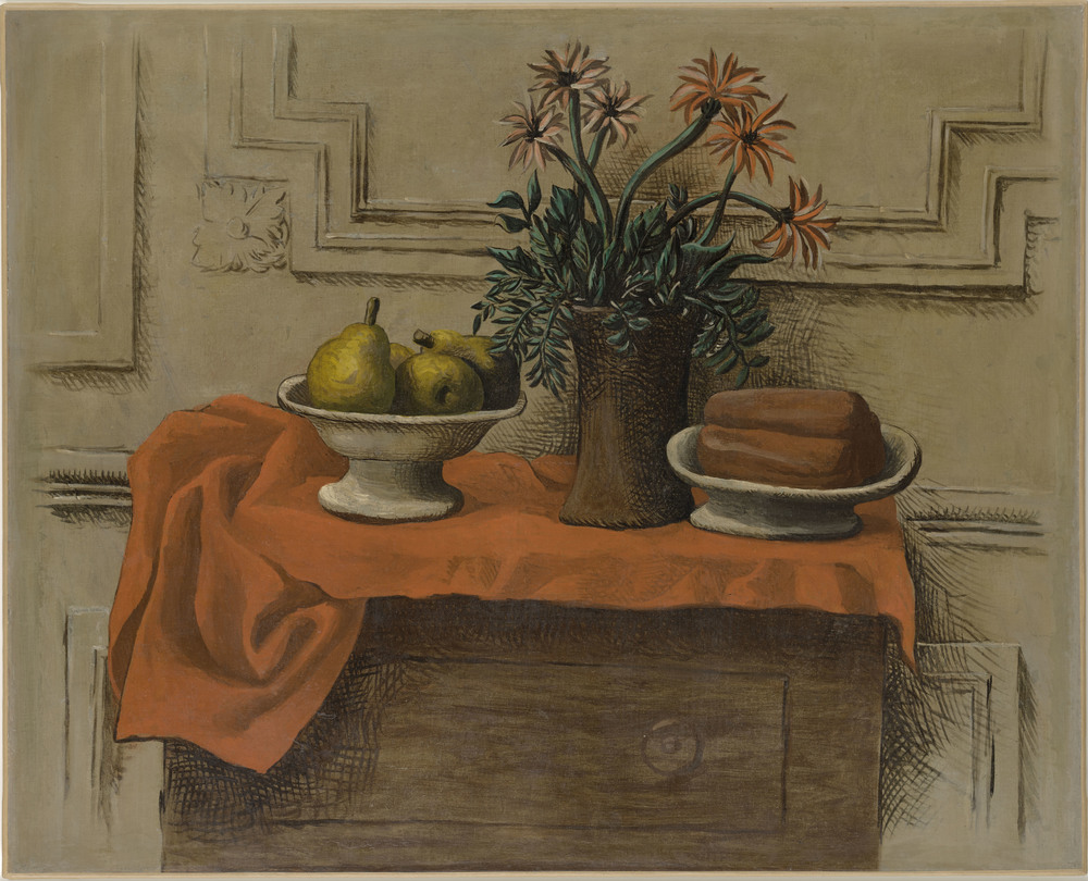
Pablo Picasso
Still life on the dresser
In "Still Life on the Dresser", orange does not serve as a decorative accent: it regulates the light, depth and general rhythm of the image. Pablo Picasso modulates the orange between ocher, vermilion and amber so that the chromatic heat remains linked to the light and structure. The transition from ocher to vermilion produces internal light; dark tones then serve as a frame and counterweight. This range directly contributes to the fame of the work: it fixes its atmosphere and visual memory.
View work in collection →
Paul Klee
Sunset
In "Sunset", orange does not serve as a decorative accent: it regulates the light, depth and general rhythm of the image. Paul Klee modulates the orange between ocher, vermilion and amber so that the chromatic heat remains linked to the light and the structure. The orange diffuses instead of closing flat: it crosses the sky, touches the water or the earth and regulates the entire temperature of the landscape. This range directly contributes to the fame of the work: it crosses the sky, touches the water or the earth and regulates the entire temperature of the landscape. This range directly contributes to the fame of the work: it fixes its atmosphere and visual memory.
See reproduction →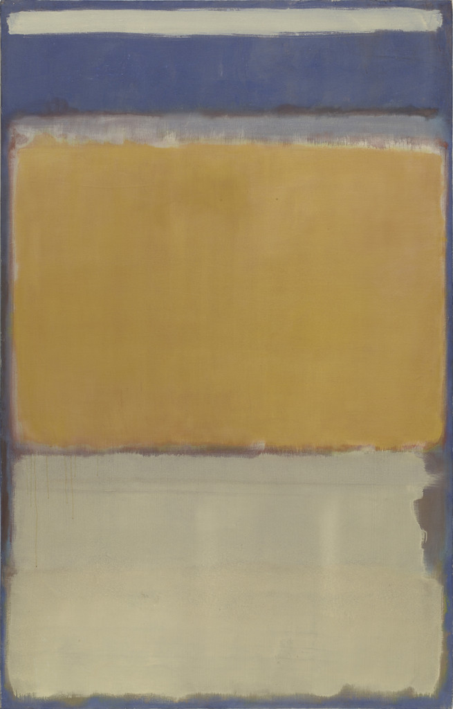
Mark Rothko
No. 10
In "No. 10", orange does not serve as a decorative accent: it regulates the light, depth and general rhythm of the image. Mark Rothko modulates the orange between ocher, vermilion and amber so that the chromatic heat remains linked to the light and structure. The orange immediately advances towards the eye, while the neighboring blues, greens and browns give it measurable depth. This range directly contributes to the celebrity of the work: it fixes its atmosphere and visual memory.
View work in collection →
Robert Delaunay
Circular shapes. Sun, Moon
In "Circular Shapes. Sun, Moon", orange does not serve as a decorative accent: it regulates the light, depth and general rhythm of the image. Delaunay makes orange a circulating energy; upon contact with blue, the color seems to advance, rotate and produce its own light. The orange diffuses instead of closing flat: it crosses the sky, touches the water or the earth and regulates the entire temperature of the landscape. This range directly contributes to the fame of the work: it crosses the sky, touches the water or the earth and regulates the entire temperature of the landscape. This range directly contributes to the fame of the work: it fixes its atmosphere and visual memory.
See reproduction →
Gustav Klimt
Goldfish
In "Goldfish", orange does not serve as a decorative accent: it regulates the light, depth and general rhythm of the image. Klimt fragments the orange between decorative motif, clothing, leaf and reflection, so as to make the scene oscillate between depth and surface. The transition from ocher to vermilion produces internal light; dark tones then serve as a frame and counterweight. This range directly contributes to the fame of the work: it fixes its atmosphere and visual memory.
See reproduction →
Henri Matisse
Yellow Odalisque
In "Odalisque jaune", orange does not serve as a decorative accent: it regulates the light, depth and general rhythm of the image. Matisse uses orange as a constructive plane, capable of bringing a wall, clothing or object together without weighing down the surface. The warm color accompanies the figure without confusing it with its decoration; a cold outline or a dull shadow maintains its presence. This range directly contributes to the celebrity of the work: it fixes its atmosphere and visual memory.
See reproduction →Body, fabric and warmth
Orange fabrics, fiery figures and interiors

Henri Matisse
Woman on a red sofa (Woman on a red sofa)
In "Woman on a Red Sofa (Woman on a Red Sofa)", orange does not serve as a decorative accent: it regulates the light, depth and general rhythm of the image. Matisse uses orange as a constructive plane, capable of bringing a wall, clothing or object together without weighing down the surface. The warm color accompanies the figure without confusing it with its decoration; a cold outline or a dull shadow maintains its presence. Color brings the body, fabric and decor together, while precisely distinguishing skin, material and reflected light.
See reproduction →
Amedeo Modigliani
Man sitting on orange background
In "Man Sitting on an Orange Background", orange does not serve as a decorative accent: it adjusts the light, depth and general rhythm of the image. Amedeo Modigliani modulates the orange between ocher, vermilion and amber so that the chromatic heat remains linked to the light and structure. Orange accents respond to each other from one object to another; they give volume to the shapes and prevent the background from remaining inert. The color brings the body, fabric and decor together, while precisely distinguishing skin, material and reflected light.
See reproduction →
Egon Schiele
Naked standing with orange drape
In "Standing nude with orange drape", orange does not serve as a decorative accent: it regulates the light, depth and general rhythm of the image. Schiele uses a dry, nervous orange that accentuates the fragility of the body or tree instead of enveloping them in comfortable warmth. Orange accents respond to each other from one object to another; they give volume to the shapes and prevent the background from remaining inert. The color brings the body, fabric and decor together, while precisely distinguishing skin, material and reflected light.
See reproduction →
John william waterhouse
Cleopatra
In "Cleopatra", orange does not serve as a decorative accent: it regulates the light, depth and general rhythm of the image. Waterhouse concentrates orange in fabrics, hair, metal or interior light, then embeds it in deep greens and browns. Warm color accompanies the figure without confusing it with its decoration; a cold outline or a dull shadow maintains its presence. Color brings the body, fabric and decor together here, while precisely distinguishing skin, material and reflected light.
See reproduction →
John william waterhouse
Circe
In "Circe", orange does not serve as a decorative accent: it regulates the light, depth and general rhythm of the image. Waterhouse concentrates orange in fabrics, hair, metal or interior light, then embeds it in deep greens and browns. Orange immediately advances towards the eye, while neighboring blues, greens and browns give it measurable depth. The orange immediately advances towards the eye, while neighboring blues, greens and browns give it measurable depth. The orange advances immediately towards the eye, while the neighboring blues, greens and browns give it measurable depth. The color here brings the body, fabric and decor together, while precisely distinguishing skin, material and reflected light.
See reproduction →
John william waterhouse
A Roman offering
In "A Roman Offering", orange does not serve as a decorative accent: it regulates the light, depth and general rhythm of the image. Waterhouse concentrates orange in fabrics, hair, metal or interior light, then embeds it in deep greens and browns. The composition is based on an exchange between amber areas and some cold accents which prevent the heat from becoming uniform. The color here brings the body, fabric and decor together, while precisely distinguishing skin, material and reflected light.
See reproduction →
John william waterhouse
An oriental interior with a girl sitting
In "An Oriental Interior with a Sitting Girl", orange does not serve as a decorative accent: it regulates the light, depth and general rhythm of the image. Waterhouse concentrates orange in fabrics, hair, metal or interior light, then embeds it in deep greens and browns. The transition from ocher to vermilion produces internal light; dark tones then serve as a frame and counterweight. The transition from ocher to vermilion produces internal light; dark tones then serve as a frame and counterweight. The transition from ocher to vermilion produces internal light; dark tones then serve as a frame and counterweight. The color brings the body, fabric and decor together, while precisely distinguishing skin, material and reflected light.
See reproduction →
John Singer Sargent
Gray Amber Smoke
In "Grey Amber Smoke", orange does not serve as a decorative accent: it regulates the light, depth and general rhythm of the image. John Singer Sargent modulates the orange between ocher, vermilion and amber so that the chromatic heat remains linked to the light and the structure. The shade does not necessarily occupy the entire canvas: placed at the right point, it is enough to direct the gaze and unify the masses. The color here brings the body, the fabric and the decor together, while precisely distinguishing skin, material and reflected light.
See reproduction →
Henri Matisse
Lorette with turban, yellow jacket
In "Lorette with turban, yellow jacket", orange does not serve as a decorative accent: it regulates the light, depth and general rhythm of the image. Matisse uses orange as a constructive plane, capable of bringing a wall, clothing or object together without weighing down the surface. Orange immediately advances towards the eye, while neighboring blues, greens and browns give it measurable depth. The orange advances immediately towards the eye, while the neighboring blues, greens and browns give it measurable depth. The orange advances immediately towards the eye, while the neighboring blues, greens and browns give it measurable depth. The color brings the body, fabric and decor together, while precisely distinguishing skin, material and reflected light.
See reproduction →
Amedeo Modigliani
Young woman in a yellow dress (Renée Modot)
In "Young Woman with a Yellow Dress (Renée Modot)", orange does not serve as a decorative accent: it regulates the light, depth and general rhythm of the image. Amedeo Modigliani modulates the orange between ocher, vermilion and amber so that the chromatic heat remains linked to the light and structure. Warm color accompanies the figure without confusing it with its decoration; a cold outline or a dull shadow maintains its presence. The color brings the body, fabric and decor together, while precisely distinguishing skin, material and reflected light.
See reproduction →
Amedeo Modigliani
Jeanne Hébuterne in the yellow sweater
In "Jeanne Hébuterne in the Yellow Sweater", orange does not serve as a decorative accent: it regulates the light, depth and general rhythm of the image. Amedeo Modigliani modulates the orange between ocher, vermilion and amber so that the chromatic heat remains linked to the light and structure. The transition from ocher to vermilion produces internal light; dark tones then serve as a frame and counterweight. The transition from ocher to vermilion produces internal light; dark tones then serve as a frame and counterweight. The color brings the body, fabric and decor together, while precisely distinguishing skin, material and reflected light.
See reproduction →
Henri Matisse
The Girl with Green Eyes
In "The Girl with Green Eyes", orange does not serve as a decorative accent: it regulates the light, depth and general rhythm of the image. Matisse uses orange as a constructive plane, capable of bringing a wall, clothing or object together without weighing down the surface. The color does not necessarily occupy the entire canvas: placed at the right point, it is enough to direct the gaze and unify the masses. Color brings the body, fabric and decor together here, while precisely distinguishing skin, material and reflected light.
See reproduction →
Henri Matisse
Odalisque Green Hairstyle
In "Odalisque Coiffure Verte", orange does not serve as a decorative accent: it regulates the light, depth and general rhythm of the image. Matisse uses orange as a constructive plane, capable of bringing a wall, clothing or object together without weighing down the surface. The warm color accompanies the figure without confusing it with its decoration; a cold outline or a dull shadow maintains its presence. Color brings the body, fabric and decor together, while precisely distinguishing skin, material and reflected light.
See reproduction →
Henri Matisse
Renée, Green Harmony
In "Renée, Harmonie verte", orange does not serve as a decorative accent: it regulates the light, depth and general rhythm of the image. Matisse uses orange as a constructive plane, capable of bringing a wall, clothing or object together without weighing down the surface. The composition is based on an exchange between amber areas and some cold accents which prevent the heat from becoming uniform. The color here brings the body, fabric and decor together, while precisely distinguishing skin, material and reflected light.
See reproduction →
Henri Matisse
The Spaniard: harmony in blue
In "The Spanish: Harmony in Blue", orange does not serve as a decorative accent: it regulates the light, depth and general rhythm of the image. Matisse uses orange as a constructive plane, capable of bringing a wall, clothing or object together without weighing down the surface. The transition from ocher to vermilion produces internal light; dark tones then serve as a frame and counterweight. The color brings the body, fabric and decor together, while precisely distinguishing skin, material and reflected light.
See reproduction →
Joaquin Sorolla
Pepilla the Gypsy and her daughter
In "Pepilla the Gypsy and her daughter", orange does not serve as a decorative accent: it regulates the light, depth and general rhythm of the image. Joaquin Sorolla modulates the orange between ocher, vermilion and amber so that the chromatic heat remains linked to the light and the structure. The color does not necessarily occupy the entire canvas: placed at the right point, it is enough to direct the gaze and unify the masses. The color here does not necessarily occupy the entire canvas: placed at the right point, it is enough to direct the gaze and unify the masses. Color brings the body, fabric and decor together, while precisely distinguishing skin, material and reflected light.
See reproduction →
Joaquin Sorolla
Maria Guerrero as The Foolish Lady
In "Maria Guerrero as The Foolish Lady", orange does not serve as a decorative accent: it regulates the light, depth and general rhythm of the image. Joaquin Sorolla modulates the orange between ocher, vermilion and amber so that the chromatic heat remains linked to the light and structure. Orange immediately advances towards the eye, while neighboring blues, greens and browns give it measurable depth. The orange advances immediately towards the eye, while the neighboring blues, greens and browns give it measurable depth. The orange advances immediately towards the eye, while the neighboring blues, greens and browns give it measurable depth. The orange advances immediately towards the eye, while the neighboring blues, greens and browns give it measurable depth. The orange advances immediately towards the eye, while the neighboring blues, greens and browns give it measurable depth. The color brings the body, fabric and decor together, while precisely distinguishing skin, material and reflected light.
See reproduction →
John william waterhouse
Juliet
In "Juliette", orange does not serve as a decorative accent: it regulates the light, depth and general rhythm of the image. Waterhouse concentrates orange in fabrics, hair, metal or interior light, then embeds it in deep greens and browns. The warm color accompanies the figure without confusing it with its decoration; a cold outline or a dull shadow maintains its presence. Color brings the body, fabric and decor together here, while precisely distinguishing skin, material and reflected light.
See reproduction →
Pierre-Auguste Renoir
Orange seller
In "Orange Merchant", orange does not serve as a decorative accent: it regulates the light, depth and general rhythm of the image. Pierre-Auguste Renoir modulates the orange between ocher, vermilion and amber so that the chromatic heat remains linked to the light and structure. Orange accents respond to each other from one object to another; they give volume to the shapes and prevent the background from remaining inert. The color brings the body, fabric and decor together, while precisely distinguishing skin, material and reflected light.
See reproduction →
John william waterhouse
Saint Eulalia
In "Sainte Eulalie", orange does not serve as a decorative accent: it regulates the light, depth and general rhythm of the image. Waterhouse concentrates orange in fabrics, hair, metal or interior light, then embeds it in deep greens and browns. The color does not necessarily occupy the entire canvas: placed at the right point, it is enough to direct the eye and unify the masses. Color here brings the body, fabric and decor together, while precisely distinguishing skin, material and reflected light.
See reproduction →The object's hot focus
Oranges, copper, flowers and still lifes

Henri Matisse
Still life with oranges - II
In "Still Life with Oranges - II", orange does not serve as a decorative accent: it regulates the light, depth and general rhythm of the image. Matisse uses orange as a constructive plane, capable of bringing a wall, clothing or object together without weighing down the surface. Orange accents respond from one object to another; they give volume to the shapes and prevent the background from remaining inert. The fruit, copper or petal becomes a hot focus whose echoes organize the table, the background and the shadows.
See reproduction →
Henri Matisse
First orange still life
In "Orange First Still Life", orange does not serve as a decorative accent: it regulates the light, depth and general rhythm of the image. Matisse uses orange as a constructive plane, capable of bringing a wall, clothing or object together without weighing down the surface. Orange accents respond from one object to another; they give volume to the shapes and prevent the background from remaining inert. The fruit, copper or petal becomes a warm focus whose echoes organize the table, the background and the shadows.
See reproduction →
Henri Matisse
Still life with oranges
In "Still Life with Oranges", orange does not serve as a decorative accent: it regulates the light, depth and general rhythm of the image. Matisse uses orange as a constructive plane, capable of bringing a wall, clothing or object together without weighing down the surface. Orange accents respond from one object to another; they give volume to the shapes and prevent the background from remaining inert. The fruit, copper or petal becomes a hot focus whose echoes organize the table, the background and the shadows.
See reproduction →
Chaïm Soutine
Oranges on a green background
In "Oranges on a Green Background", orange does not serve as a decorative accent: it regulates the light, depth and general rhythm of the image. Chaïm Soutine modulates the orange between ocher, vermilion and amber so that the chromatic heat remains linked to the light and structure. Orange accents respond from one object to another; they give volume to the shapes and prevent the background from remaining inert. The fruit, copper or petal becomes a hot focus whose echoes organize the table, the background and the shadows.
See reproduction →
Piet Mondrian
Oranges and decorated plate
In "Oranges and Decorated Plate", orange does not serve as a decorative accent: it regulates the light, depth and general rhythm of the image. Before geometric abstraction, Mondrian already observed how the orange of a tree, fruit or sky can structure the entire visual field. Orange accents respond to each other from one object to another; they give volume to the shapes and prevent the background from remaining inert. The fruit, copper or petal becomes a hot focus whose echoes organize the table, the background and the shadows.
See reproduction →
Eugene Delacroix
Orange merchant in Morocco
In "Orange Merchant in Morocco", orange does not serve as a decorative accent: it regulates the light, depth and general rhythm of the image. Eugène Delacroix modulates the orange between ocher, vermilion and amber so that the chromatic heat remains linked to the light and structure. Orange accents respond from one object to another; they give volume to the shapes and prevent the background from remaining inert. The fruit, copper or petal becomes a hot focus whose echoes organize the table, the background and the shadows.
See reproduction →
John william waterhouse
The orange pickers
In "The Orange Pickers", orange does not serve as a decorative accent: it regulates the light, depth and general rhythm of the image. Waterhouse concentrates orange in fabrics, hair, metal or interior light, then embeds it in deep greens and browns. Orange accents respond from one object to another; they give volume to the shapes and prevent the background from remaining inert. The fruit, copper or petal becomes a warm focus whose echoes organize the table, the background and the shadows.
See reproduction →
Paul Cezanne
Apples and oranges
In "Apples and Oranges", orange does not serve as a decorative accent: it regulates the light, depth and general rhythm of the image. Paul Cézanne modulates the orange between ocher, vermilion and amber so that the chromatic heat remains linked to the light and structure. Orange accents respond from one object to another; they give volume to the shapes and prevent the background from remaining inert. The fruit, copper or petal becomes a hot focus whose echoes organize the table, the background and the shadows.
See reproduction →
Vincent van Gogh
Fritillaries imperial crown in a copper vase
In "Imperial Crown Fritillaries in a Copper Vase", orange does not serve as a decorative accent: it regulates the light, depth and general rhythm of the image. Van Gogh contrasts orange with intense blues and greens; this complementarity gives the canvas an immediate and almost physical vibration. Orange accents respond from one object to another; they give volume to the shapes and prevent the background from remaining inert. The fruit, copper or petal becomes a warm focus whose echoes organize the table, the background and the shadows.
See reproduction →
Henri Matisse
Sunflower vase
In "Sunflower Vase", orange does not serve as a decorative accent: it regulates the light, depth and general rhythm of the image. Matisse uses orange as a constructive plane, capable of bringing a wall, clothing or object together without weighing down the surface. Orange accents respond from one object to another; they give volume to the shapes and prevent the background from remaining inert. The fruit, copper or petal becomes a warm focus whose echoes organize the table, the background and the shadows.
See reproduction →
Wassily Kandinsky
Orange Purple
In "Orange Violet", orange does not serve as a decorative accent: it regulates the light, depth and general rhythm of the image. Kandinsky releases the orange from the pattern and treats it as a warm sound whose intensity depends on neighboring blues, purples and blacks. Orange accents respond to each other from one object to another; they give volume to the shapes and prevent the background from remaining inert. The fruit, copper or petal becomes a warm focus whose echoes organize the table, the background and the shadows.
See reproduction →
Robert Delaunay
Window with orange curtains
In "Window with Orange Curtains", orange does not serve as a decorative accent: it regulates the light, depth and general rhythm of the image. Delaunay makes orange a circulating energy; upon contact with blue, the color seems to advance, rotate and produce its own light. Orange accents respond from one object to another; they give volume to the shapes and prevent the background from remaining inert. The fruit, copper or petal becomes a warm focus whose echoes organize the table, the background and the shadows.
See reproduction →
Jackson Pollock
Flame
In "Flame", orange does not serve as a decorative accent: it regulates the light, depth and general rhythm of the image. Pollock disperses orange ochres and copper browns in a centerless network, where color preserves the memory of movement. The orange immediately advances towards the eye, while the neighboring blues, greens and browns give it measurable depth. The fruit, copper or petal becomes a hot focus whose echoes organize the table, the background and the shadows.
See reproduction →
Gustav Klimt
Lady by the Fire (Lady am Kamin)
In "Lady by the Fire (Lady am Kamin)", orange does not serve as a decorative accent: it regulates the light, depth and general rhythm of the image. Klimt fragments the orange between decorative pattern, clothing, leaf and reflection, so as to make the scene oscillate between depth and surface. The composition is based on an exchange between amber areas and some cold accents which prevent the heat from becoming uniform. The composition is based on an exchange between amber areas and some cold accents which prevent the heat from becoming uniform. The fruit, copper or petal becomes a warm focus whose echoes organize the table, the background and the shadows.
See reproduction →
Henri Matisse
Yellow roses with parakeet cage
In "Yellow Roses with Parakeet Cage", orange does not serve as a decorative accent: it regulates the light, depth and general rhythm of the image. Matisse uses orange as a constructive plane, capable of bringing a wall, clothing or object together without weighing down the surface. The transition from ocher to vermilion produces internal light; dark tones then serve as a frame and counterweight. The passage from ocher to vermilion produces internal light; dark tones then serve as a frame and counterweight. The fruit, copper or petal becomes a warm focus whose echoes organize the table, the background and the shadows.
See reproduction →
Piet Mondrian
Yellow chrysanthemums in a ginger pot
In "Yellow Chrysanthemums in a Ginger Pot", orange does not serve as a decorative accent: it regulates the light, depth and general rhythm of the image. Before geometric abstraction, Mondrian already observes how the orange of a tree, fruit or sky can structure the entire visual field. Orange accents respond to each other from one object to another; they give volume to the shapes and prevent the background from remaining inert. The fruit, copper or petal becomes a hot focus whose echoes organize the table, the background and the shadows.
See reproduction →
Henri Matisse
Reader at the yellow table
In "Reader at the Yellow Table", orange does not serve as a decorative accent: it regulates the light, depth and general rhythm of the image. Matisse uses orange as a constructive plane, capable of bringing a wall, clothing or object together without weighing down the surface. The orange immediately advances towards the eye, while the neighboring blues, greens and browns give it measurable depth. The orange advances immediately towards the eye, while the neighboring blues, greens and browns give it measurable depth. The fruit, copper or petal becomes a hot focus whose echoes organize the table, the background and the shadows.
See reproduction →
Joaquin Sorolla
Sale of melons
In "Sale of Melons", orange does not serve as a decorative accent: it regulates the light, depth and general rhythm of the image. Joaquin Sorolla modulates the orange between ocher, vermilion and amber so that the chromatic heat remains linked to the light and structure. Orange accents respond from one object to another; they give volume to the shapes and prevent the background from remaining inert. The fruit, copper or petal becomes a hot focus whose echoes organize the table, the background and the shadows.
See reproduction →
Paul Cezanne
Curtain, jug and compote maker
In "Rideau, jug and compotier", orange does not serve as a decorative accent: it regulates the light, depth and general rhythm of the image. Paul Cézanne modulates the orange between ocher, vermilion and amber so that the chromatic heat remains linked to the light and the structure. The transition from ocher to vermilion produces internal light; dark tones then serve as a frame and counterweight. The transition from ocher to vermilion produces internal light; dark tones then serve as a frame and counterweight. The passage from ocher to vermilion produces internal light; dark tones then serve as a frame and counterweight. The fruit, copper or petal becomes a hot focus whose echoes organize the table, the background and the shadows.
See reproduction →
Henri Matisse
Goldfish
In "Goldfish", orange does not serve as a decorative accent: it regulates the light, depth and general rhythm of the image. Matisse uses orange as a constructive plane, capable of bringing a wall, clothing or object together without weighing down the surface. The color does not necessarily occupy the entire canvas: placed at the right point, it is enough to direct the gaze and unify the masses. The fruit, copper or petal becomes a warm focus whose echoes organize the table, the background and the shadows.
See reproduction →The color of a transformation
Autumn foliage and orange harvests

Piet Mondrian
Two trees with orange foliage against the blue sky
In "Two Trees with Orange Foliage Against the Blue Sky", orange does not serve as a decorative accent: it regulates the light, depth and general rhythm of the image. Before geometric abstraction, Mondrian already observed how the orange of a tree, fruit or sky can structure the entire visual field. Orange accents respond to each other from one object to another; they give volume to the shapes and prevent the background from remaining inert. Orange reflects less a season than a transformation: greenery, earth and light switch together towards a denser palette.
See reproduction →
Edvard Munch
Autumn landscape
In "Autumn Landscape", orange does not serve as a decorative accent: it regulates the light, depth and general rhythm of the image. Munch shifts the orange from landscape to emotion: foliage, sun and soil become signs of heat, wear or worry. The range changes from yellow to copper then to red-brown, creating a depth that follows the transformation of vegetation and soil. The range changes from yellow to copper then to red-brown, creating a depth that follows the transformation of vegetation and soil. The range changes from yellow to copper then to red-brown, creating a depth that follows the transformation of vegetation and soil. The orange translates less a season than a transformation: greenery, earth and light switch together towards a denser palette.
See reproduction →
Edvard Munch
Autumn colors
In "Autumn Colors", orange does not serve as a decorative accent: it regulates the light, depth and general rhythm of the image. Munch shifts the orange from landscape to emotion: foliage, sun and soil become signs of heat, wear or worry. The range changes from yellow to copper then to red brown, creating a depth that follows the transformation of vegetation and soil. The range changes from yellow to copper then to red brown, creating a depth that follows the transformation of vegetation and soil. The range changes from yellow to copper then to red brown, creating a depth that follows the transformation of vegetation and soil. The orange translates less a season than a transformation: greenery, earth and light switch together towards a denser palette.
See reproduction →
Edvard Munch
Autumn in the forest
In "Autumn in the Forest", orange does not serve as a decorative accent: it regulates the light, depth and general rhythm of the image. Munch shifts the orange from landscape to emotion: foliage, sun and soil become signs of heat, wear or worry. The range changes from yellow to copper then to red-brown, creating a depth that follows the transformation of vegetation and soil. The range changes from yellow to copper then to red-brown, creating a depth that follows the transformation of vegetation and soil. The range changes from yellow to copper then to red-brown, creating a depth that follows the transformation of vegetation and soil. The orange translates less a season than a transformation: greenery, earth and light switch together towards a denser palette.
See reproduction →
Edvard Munch
Autumn in Vestre Aker
In "Autumn in Vestre Aker", orange does not serve as a decorative accent: it regulates the light, depth and general rhythm of the image. Munch shifts the orange from landscape to emotion: foliage, sun and soil become signs of heat, wear or worry. The range changes from yellow to copper then to red-brown, creating a depth that follows the transformation of vegetation and soil. The range changes from yellow to copper then to red-brown, creating a depth that follows the transformation of vegetation and soil. The range changes from yellow to copper then to red-brown, creating a depth that follows the transformation of vegetation and soil. The orange translates less a season than a transformation: greenery, earth and light switch together towards a denser palette.
See reproduction →
Edvard Munch
Autumn
In "Autumn", orange does not serve as a decorative accent: it regulates the light, depth and general rhythm of the image. Munch shifts the orange from landscape to emotion: foliage, sun and soil become signs of heat, wear or worry. The range changes from yellow to copper then to red-brown, creating a depth that follows the transformation of vegetation and soil. The range changes from yellow to copper then to red-brown, creating a depth that follows the transformation of vegetation and soil. The range changes from yellow to copper then to red-brown, creating a depth that follows the transformation of vegetation and soil. The orange translates less a season than a transformation: greenery, earth and light switch together towards a denser palette.
See reproduction →
Edvard Munch
Greenhouse in the fall
In "Greenhouse in Autumn", orange does not serve as a decorative accent: it regulates the light, depth and general rhythm of the image. Munch shifts the orange from landscape to emotion: foliage, sun and soil become signs of heat, wear or worry. The range changes from yellow to copper then to red-brown, creating a depth that follows the transformation of vegetation and soil. The range changes from yellow to copper then to red-brown, creating a depth that follows the transformation of vegetation and soil. The range changes from yellow to copper then to red-brown, creating a depth that follows the transformation of vegetation and soil. The orange translates less a season than a transformation: greenery, earth and light switch together towards a denser palette.
See reproduction →
Edvard Munch
Women in the harvest
In "Women in the Harvest", orange does not serve as a decorative accent: it regulates the light, depth and general rhythm of the image. Munch shifts the orange from landscape to emotion: foliage, sun and soil become signs of heat, wear or worry. The range changes from yellow to copper then to red-brown, creating a depth that follows the transformation of vegetation and soil. The range changes from yellow to copper then to red-brown, creating a depth that follows the transformation of vegetation and soil. The range changes from yellow to copper then to red-brown, creating a depth that follows the transformation of vegetation and soil. The orange translates less a season than a transformation: greenery, earth and light switch together towards a denser palette.
See reproduction →
Edvard Munch
Corn harvest
In "Corn Harvest", orange does not serve as a decorative accent: it regulates the light, depth and general rhythm of the image. Munch shifts the orange from landscape to emotion: foliage, sun and soil become signs of heat, wear or worry. The range changes from yellow to copper then to red-brown, creating a depth that follows the transformation of vegetation and soil. The range changes from yellow to copper then to red-brown, creating a depth that follows the transformation of vegetation and soil. The range changes from yellow to copper then to red-brown, creating a depth that follows the transformation of vegetation and soil. The orange translates less a season than a transformation: greenery, earth and light switch together towards a denser palette.
See reproduction →
Egon Schiele
Autumn tree in the choppy air (winter tree)
In "Autumn Tree in the Restless Air (Winter Tree)", orange does not serve as a decorative accent: it regulates the light, depth and general rhythm of the image. Schiele uses a dry, nervous orange that accentuates the fragility of the body or tree instead of enveloping them in comfortable warmth. The range changes from yellow to copper then to red-brown, creating a depth that follows the transformation of vegetation and soil. The range changes from yellow to copper then to red-brown, creating a depth that follows the transformation of vegetation and soil. Orange translates less of a season than of a transformation: greenery, earth and light switch together towards a denser palette.
See reproduction →
Wassily Kandinsky
Autumn
In "Autumn", orange does not serve as a decorative accent: it regulates the light, depth and general rhythm of the image. Kandinsky releases the orange from the pattern and treats it as a warm sound whose intensity depends on neighboring blues, purples and blacks. The range changes from yellow to copper then to red-brown, creating a depth that follows the transformation of the vegetation and soil. The range changes from yellow to copper then to red-brown, creating a depth that follows the transformation of the vegetation and soil. Orange translates less of a season than of a transformation: greenery, earth and light switch together towards a denser palette.
See reproduction →
Wassily Kandinsky
Autumn II
In "Autumn II", orange does not serve as a decorative accent: it regulates the light, depth and general rhythm of the image. Kandinsky releases the orange from the pattern and treats it as a warm sound whose intensity depends on neighboring blues, purples and blacks. The range changes from yellow to copper then to red-brown, creating a depth that follows the transformation of the vegetation and soil. The range changes from yellow to copper then to red-brown, creating a depth that follows the transformation of the vegetation and soil. Orange translates less of a season than of a transformation: greenery, earth and light switch together towards a denser palette.
See reproduction →
Wassily Kandinsky
Autumn in Bavaria
In "Autumn in Bavaria", orange does not serve as a decorative accent: it regulates the light, depth and general rhythm of the image. Kandinsky releases the orange from the pattern and treats it as a warm sound whose intensity depends on neighboring blues, purples and blacks. The range changes from yellow to copper then to red-brown, creating a depth that follows the transformation of the vegetation and soil. The range changes from yellow to copper then to red-brown, creating a depth that follows the transformation of the vegetation and soil. Orange translates less of a season than of a transformation: greenery, earth and light switch together towards a denser palette.
See reproduction →
Wassily Kandinsky
Akhtyrka, autumn
In "Akhtyrka, Autumn", orange does not serve as a decorative accent: it regulates the light, depth and general rhythm of the image. Kandinsky releases the orange from the pattern and treats it as a warm sound whose intensity depends on neighboring blues, purples and blacks. The range changes from yellow to copper then to red-brown, creating a depth that follows the transformation of the vegetation and soil. The range changes from yellow to copper then to red-brown, creating a depth that follows the transformation of the vegetation and soil. The orange translates less a season than a transformation: greenery, earth and light switch together towards a denser palette.
See reproduction →
Wassily Kandinsky
Autumn landscape with canoes
In "Autumn Landscape with Canoes", orange does not serve as a decorative accent: it regulates the light, depth and general rhythm of the image. Kandinsky releases the orange from the pattern and treats it as a warm sound whose intensity depends on neighboring blues, purples and blacks. The range changes from yellow to copper then to red-brown, creating a depth that follows the transformation of the vegetation and soil. The range changes from yellow to copper then to red-brown, creating a depth that follows the transformation of the vegetation and soil. The orange translates less a season than a transformation: greenery, earth and light switch together towards a denser palette.
See reproduction →
Wassily Kandinsky
In the Saint-Cloud park - Autumn II
In "In the Park of Saint-Cloud - Autumn II", orange does not serve as a decorative accent: it regulates the light, depth and general rhythm of the image. Kandinsky releases the orange from the pattern and treats it as a warm sound whose intensity depends on neighboring blues, purples and blacks. The range changes from yellow to copper then to red brown, creating a depth that follows the transformation of the vegetation and soil. The range changes from yellow to copper then to red brown, creating a depth that follows the transformation of the vegetation and soil. The orange translates less a season than a transformation: greenery, earth and light switch together towards a denser palette.
See reproduction →
Francis Picabia
Autumn effect, morning sun
In "Autumn Effect, Morning Sun", orange does not serve as a decorative accent: it regulates the light, depth and general rhythm of the image. Francis Picabia modulates the orange between ocher, vermilion and amber so that the chromatic heat remains linked to the light and structure. The range changes from yellow to copper then to reddish brown, creating a depth that follows the transformation of vegetation and soil. The range changes from yellow to copper then to reddish brown, creating a depth that follows the transformation of vegetation and soil. The range changes from yellow to copper then to reddish brown, creating a depth that follows the transformation of vegetation and soil. The range changes from yellow to copper then to reddish brown, creating a depth that follows the transformation of vegetation and soil. The orange translates less a season than a transformation: greenery, earth and light switch together towards a denser palette.
See reproduction →
Francis Picabia
The banks of the Loing; autumn effect in the morning in Moret
In "Les Bords du Loing; autumn effect in the morning in Moret", orange does not serve as a decorative accent: it regulates the light, depth and general rhythm of the image. Francis Picabia modulates the orange between ocher, vermilion and amber so that the chromatic heat remains linked to the light and structure. The range changes from yellow to copper then to reddish brown, creating a depth that follows the transformation of vegetation and soil. The range changes from yellow to copper then to reddish brown, creating a depth that follows the transformation of vegetation and soil. The range changes from yellow to copper then to reddish brown, creating a depth that follows the transformation of vegetation and soil. The range changes from yellow to copper then to reddish brown, creating a depth that follows the transformation of vegetation and soil. The range changes from yellow to copper then to reddish brown, creating a depth that follows the transformation of vegetation and soil. The orange changes less a season than a transformation: greenery, earth and light switch together towards a denser palette.
See reproduction →
Henri Rousseau
A Corner of the Bellevue Plateau. autumn, setting sun
In "A Corner of the Bellevue Plateau. autumn, setting sun", orange does not serve as a decorative accent: it regulates the light, depth and general rhythm of the image. Henri Rousseau modulates the orange between ocher, vermilion and amber so that the chromatic heat remains linked to the light and structure. The range changes from yellow to copper then to reddish brown, creating a depth that follows the transformation of the vegetation and the soil. The range changes from yellow to copper then to reddish brown, creating a depth that follows the transformation of the vegetation and the soil. The range changes from yellow to copper then to reddish brown, creating a depth that follows the transformation of the vegetation and the soil. The range changes from yellow to copper then to reddish brown, creating a depth that follows the transformation of the vegetation and the soil. The orange translates less a season than a transformation: greenery, earth and light switch together towards a denser palette.
See reproduction →
Gustav Klimt
Birch forest
In "Birch Forest", orange does not serve as a decorative accent: it regulates the light, depth and general rhythm of the image. Klimt fragments the orange between decorative pattern, clothing, leaf and reflection, so as to make the scene oscillate between depth and surface. The range changes from yellow to copper then to red-brown, creating a depth that follows the transformation of vegetation and soil. The range changes from yellow to copper then to red-brown, creating a depth that follows the transformation of vegetation and soil. The orange translates less a season than a transformation: greenery, earth and light switch together towards a denser palette.
See reproduction →The Orange Hour of Landscape
Sunsets, flames and amber lights

Theodore Rousseau
Sunset in Barbizon
In "Sunset at Barbizon", orange does not serve as a decorative accent: it regulates the light, depth and general rhythm of the image. Rousseau lets the orange of the sunset penetrate the earth, trunks and clouds; light becomes a slow material rather than a simple effect. The orange diffuses instead of closing flat: it crosses the sky, touches the water or the earth and regulates the entire temperature of the landscape. The hue acts like an hour of the day, warming the horizon and giving blue or purple shadows a more sensitive depth.
See reproduction →
Theodore Rousseau
Forest edge, sunset
In "Forest Edge, Sunset", orange does not serve as a decorative accent: it regulates the light, depth and general rhythm of the image. Rousseau lets the orange of the sunset penetrate the land, trunks and clouds; light becomes a slow material rather than a simple effect. The range changes from yellow to copper and then to red-brown, creating a depth that follows the transformation of vegetation and soil. The hue acts like an hour of day, warming the horizon and giving blue or purple shadows a more noticeable depth.
See reproduction →
Theodore Rousseau
Twilight in a forest
In "Twilight in a Forest", orange does not serve as a decorative accent: it regulates the light, depth and general rhythm of the image. Rousseau lets the orange of the sunset penetrate the land, trunks and clouds; light becomes a slow material rather than a simple effect. The range changes from yellow to copper and then to red-brown, creating a depth that follows the transformation of vegetation and soil. The hue acts like an hour of day, warming the horizon and giving blue or purple shadows a more noticeable depth.
See reproduction →
Theodore Rousseau
An autumn evening
In "An Autumn Evening", orange does not serve as a decorative accent: it regulates the light, depth and general rhythm of the image. Rousseau lets the orange of the sunset penetrate the earth, trunks and clouds; light becomes a slow material rather than a simple effect. The range changes from yellow to copper and then to red-brown, creating a depth that follows the transformation of vegetation and soil. The hue acts like an hour of the day, warming the horizon and giving blue or purple shadows a more noticeable depth.
See reproduction →
Theodore Rousseau
Sunset near Arbonne
In "Sunset near Arbonne", orange does not serve as a decorative accent: it regulates the light, depth and general rhythm of the image. Rousseau lets the orange of the sunset penetrate the earth, trunks and clouds; light becomes a slow material rather than a simple effect. The orange diffuses instead of closing flat: it crosses the sky, touches the water or the earth and regulates the entire temperature of the landscape. The hue acts like an hour of the day, warming the horizon and giving blue or purple shadows a more sensitive depth.
See reproduction →
Theodore Rousseau
Landscape at red sunset
In "Landscape at Red Sunset", orange does not serve as a decorative accent: it regulates the light, depth and general rhythm of the image. Rousseau lets the orange of the sunset penetrate the earth, trunks and clouds; light becomes a slow material rather than a simple effect. The orange diffuses instead of closing flat: it crosses the sky, touches the water or earth and regulates the entire temperature of the landscape. The hue acts like an hour of the day, warming the horizon and giving blue or purple shadows a more sensitive depth.
See reproduction →
Theodore Rousseau
Sunset in Apremont
In "Sunset at Apremont", orange does not serve as a decorative accent: it regulates the light, depth and general rhythm of the image. Rousseau lets the orange of the sunset penetrate the earth, trunks and clouds; light becomes a slow material rather than a simple effect. The orange diffuses instead of closing flat: it crosses the sky, touches the water or the earth and regulates the entire temperature of the landscape. The hue acts like an hour of the day, warming the horizon and giving blue or purple shadows a more sensitive depth.
See reproduction →
Theodore Rousseau
Sunset in Auvergne
In "Sunset in Auvergne", orange does not serve as a decorative accent: it regulates the light, depth and general rhythm of the image. Rousseau lets the orange of the sunset penetrate the earth, trunks and clouds; light becomes a slow material rather than a simple effect. The orange diffuses instead of closing flat: it crosses the sky, touches the water or the earth and regulates the entire temperature of the landscape. The hue acts like an hour of the day, warming the horizon and giving blue or purple shadows a more sensitive depth.
See reproduction →
Claude Monet
Parliament, sunset
In "Parliament, Sunset", orange does not serve as a decorative accent: it regulates the light, depth and general rhythm of the image. Monet transforms orange into an atmospheric phenomenon: the hue diffuses into the purple mists, water blues and grays of the sky. Orange diffuses instead of closing flat: it crosses the sky, touches the water or earth and regulates the entire temperature of the landscape. The hue diffuses instead of closing flat: it crosses the sky, touches the water or earth and regulates the entire temperature of the landscape. The hue acts like an hour of the day, warming the horizon and giving blue or purple shadows a more sensitive depth.
See reproduction →
Edvard Munch
Sunset, Nordstrand
In "Sunset, Nordstrand", orange does not serve as a decorative accent: it regulates the light, depth and general rhythm of the image. Munch shifts the orange from landscape to emotion: foliage, sun and ground become signs of heat, wear or worry. The orange diffuses instead of closing flat: it crosses the sky, touches the water or earth and regulates the entire temperature of the landscape. The orange diffuses instead of closing flat: it crosses the sky, touches the water or earth and regulates the entire temperature of the landscape. The hue acts like an hour of the day, warming the horizon and giving blue or purple shadows a more noticeable depth.
See reproduction →
Wassily Kandinsky
Binz auf Rügen (Twilight)
In "Binz auf Rügen (Twilight)", orange does not serve as a decorative accent: it regulates the light, depth and general rhythm of the image. Kandinsky releases the orange from the pattern and treats it as a warm sound whose intensity depends on neighboring blues, purples and blacks. The orange diffuses instead of closing flat: it crosses the sky, touches the water or earth and regulates the entire temperature of the landscape. The hue acts like an hour of the day, warming the horizon and giving blue or purple shadows a more sensitive depth.
See reproduction →
Wassily Kandinsky
Twilight in the English garden, Munich
In "Twilight in the English Garden, Munich", orange does not serve as a decorative accent: it regulates the light, depth and general rhythm of the image. Kandinsky releases the orange from the pattern and treats it as a warm sound whose intensity depends on neighboring blues, purples and blacks. The orange diffuses instead of closing flat: it crosses the sky, touches the water or earth and regulates the entire temperature of the landscape. The hue acts like an hour of the day, warming the horizon and giving blue or purple shadows a more sensitive depth.
See reproduction →
Piet Mondrian
Oostzijdse mill with panoramic sunset, mill in the center
In "Oostzijdse Mill with panoramic sunset, mill in the center", orange does not serve as a decorative accent: it regulates the light, depth and general rhythm of the image. Before geometric abstraction, Mondrian already observed how the orange of a tree, fruit or sky can structure the entire visual field. Orange diffuses instead of closing flat: it crosses the sky, touches the water or the earth and regulates the entire temperature of the landscape. The orange diffuses instead of closing flat: it crosses the sky, touches the water or the earth and regulates the entire temperature of the landscape. The orange diffuses instead of closing flat: it crosses the sky, touches the water or the earth and regulates the entire temperature of the landscape. The hue acts like an hour of the day, warming the horizon and giving blue or purple shadows a more sensitive depth.
See reproduction →
JMW Turner
The Fighting Temeraire Tugged to Her Last Berth to be Broken Up, 1838
In "The Fighting Temeraire Tugged to Her Last Berth to be Broken Up, 1838", orange does not serve as a decorative accent: it regulates the light, depth and general rhythm of the image. JMW Turner modulates the orange between ocher, vermilion and amber so that the chromatic heat remains linked to the light and structure. The composition is based on an exchange between amber areas and some cold accents that prevent the heat from becoming uniform. The composition is based on an exchange between amber areas and some cold accents that prevent the heat from becoming uniform. The hue acts like an hour of day, warming the horizon and giving blue or purple shadows a more noticeable depth.
See reproduction →
Jean-Baptiste Camille Corot
Memory of Ville-d'Avray, setting sun
In "Souvenir de Ville-d'Avray, setting sun", orange does not serve as a decorative accent: it regulates the light, depth and general rhythm of the image. Jean-Baptiste Camille Corot modulates the orange between ocher, vermilion and amber so that the chromatic heat remains linked to the light and the structure. Orange diffuses instead of closing flat: it crosses the sky, touches the water or earth and regulates the entire temperature of the landscape. The orange diffuses instead of closing flat: it crosses the sky, touches the water or earth and regulates the entire temperature of the landscape. The orange diffuses instead of closing flat: it crosses the sky, touches the water or earth and regulates the entire temperature of the landscape. The hue acts like an hour of day, warming the horizon and giving blue or purple shadows a more sensitive depth.
See reproduction →
Frederick McCubbin
Lost
In "Lost", orange does not serve as a decorative accent: it regulates the light, depth and general rhythm of the image. Frederick McCubbin modulates the orange between ocher, vermilion and amber so that the chromatic heat remains linked to the light and structure. The hue does not necessarily occupy the entire canvas: placed at the right point, it is enough to orient the gaze and unify the masses. The hue does not necessarily occupy the entire canvas: placed at the right point, it is enough to orient the gaze and unify the masses. The hue acts like an hour of the day, warming the horizon and giving blue or purple shadows a more sensitive depth.
See reproduction →
Frederick McCubbin
The pioneer
In "The pioneer", orange does not serve as a decorative accent: it regulates the light, depth and general rhythm of the image. Frederick McCubbin modulates the orange between ocher, vermilion and amber so that the chromatic heat remains linked to the light and structure. The orange immediately advances towards the eye, while the neighboring blues, greens and browns give it measurable depth. The orange immediately advances towards the eye, while the neighboring blues, greens and browns give it measurable depth. The hue acts like an hour of day, warming the horizon and giving blue or purple shadows a more noticeable depth.
See reproduction →
Tom Roberts
Slumbering sea, Mentone
In "Slumbering sea, Mentone", orange does not serve as a decorative accent: it regulates the light, depth and general rhythm of the image. Tom Roberts modulates the orange between ocher, vermilion and amber so that the chromatic heat remains linked to the light and structure. The composition is based on an exchange between amber areas and some cold accents that prevent the heat from becoming uniform. The tint acts like an hour of day, warming the horizon and giving blue or purple shadows a more noticeable depth.
See reproduction →
Piet Mondrian
Mill in sunlight
In "Mill in the Sunlight", orange does not serve as a decorative accent: it regulates the light, depth and general rhythm of the image. Before geometric abstraction, Mondrian already observes how the orange of a tree, fruit or sky can structure the entire visual field. Orange diffuses instead of closing flat: it crosses the sky, touches the water or earth and regulates the entire temperature of the landscape. The orange diffuses instead of closing flat: it crosses the sky, touches the water or earth and regulates the entire temperature of the landscape. The hue acts like an hour of the day, warming the horizon and giving blue or purple shadows a more sensitive depth.
See reproduction →
Vincent van Gogh
La Méridienne, known as La Sieste
In "La Méridienne, known as La Sieste", orange does not serve as a decorative accent: it regulates the light, depth and general rhythm of the image. Van Gogh contrasts orange with intense blues and greens; this complementarity gives the canvas an immediate and almost physical vibration. The hue does not necessarily occupy the entire canvas: placed at the right point, it is enough to direct the gaze and unify the masses. The hue does not necessarily occupy the entire canvas: placed at the right point, it is enough to direct the gaze and unify the masses. The hue acts like an hour of the day, warming the horizon and giving blue or purple shadows a more sensitive depth.
See reproduction →Color matter
Five historic routes to orange
Painters have long obtained their oranges by bringing together or mixing yellow and red earths. This solution gives stable, natural and modular tones, from apricot to brick. Other ancient materials, such as realgar, offered a bright orange but proved toxic and sensitive to light. Their story reminds us that the color of a painting depends as much on chemistry as on the look.
The 19th century brought chromium orange then cadmiums, more opaque and more saturated. These colors accompany outdoor painting, contrast with blue and the progressive emancipation of color. Modern organic pigments then expand the range towards transparent or very bright oranges. In oil, orange can thus become amber glaze, solar paste, metallic reflection or almost electric flat.
Yellow and red ochres produce a solid range of natural oranges, from terracotta to harvest light.
Ancient mineral pigment of a luminous orange, historically valuable but toxic and vulnerable to transformation.
Appearing in the 19th century, it offers a covering and warm color whose stability varies depending on the formulation.
Dense, opaque and saturated, it allows modern painters to construct vast luminous surfaces.
Contemporary organic pigments offer transparent or intense tones, from coral to tangerine.
Selection method
Really verified orange harmonies
Oil only
The hundred original works are oil paintings. Drawings, inks, pastels, watercolors, prints and photographs are excluded.
Orange must structure
The selection combines visual control and measurement of amber, orange ocher, vermilion, copper and tangerine areas; an isolated detail is not enough.
Controlled images and links
Each image has been tested. The Shopify button is used when reproduction exists; otherwise, it leads to the institutional source.
Frequently asked questions
Look at orange differently
Is orange a pigment or a mixture?
It can be both. Painters often mix yellow and red, but they also have specific orange pigments, ancient or modern, with different opacity and stability.
Why does blue vibrate orange?
Blue and orange occupy opposite positions in many color circles. Juxtaposed, they mutually accentuate their intensity; Monet and Van Gogh powerfully exploit this contrast.
Where does orange end and ocher or brown begin?
The border depends on light and neighboring colors. Ocher contains more earth and brown is darker; they only enter here when orange heat remains clearly perceptible and structuring.
Why are there many autumns and sunsets?
These patterns allow orange to pass through several elements at once: foliage, sky, water, soil and architecture. Color then becomes an atmosphere rather than an object.
How are works classified?
The top spots combine international fame, historical significance and the power of orange harmony. The following chapters develop the figure, still life, autumn and evening lights.
0 comments